Kyle Johnson
Level: BUS Navigation App | LIVE PROTOTYPE
Project Brief:
What is Level?
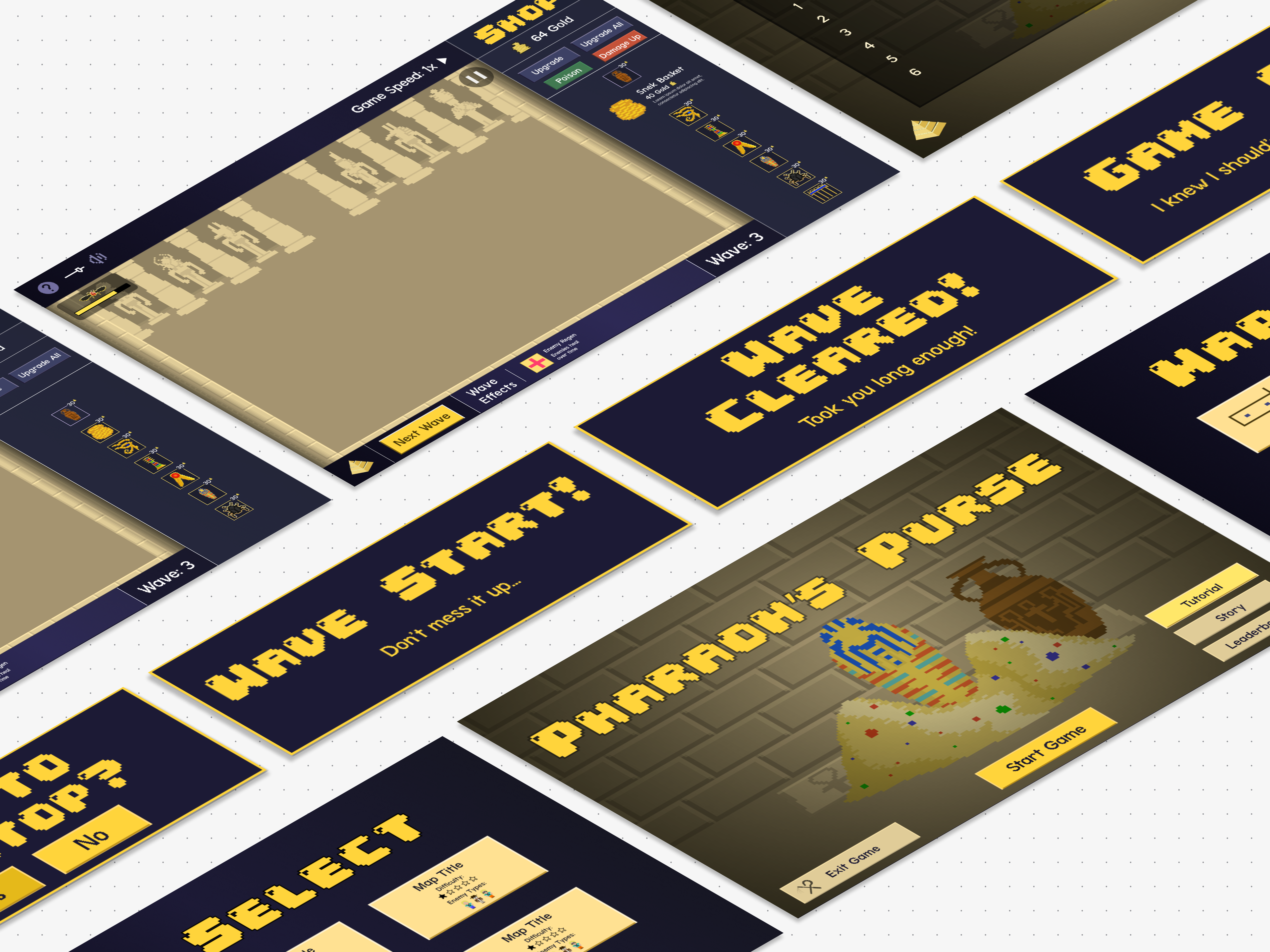
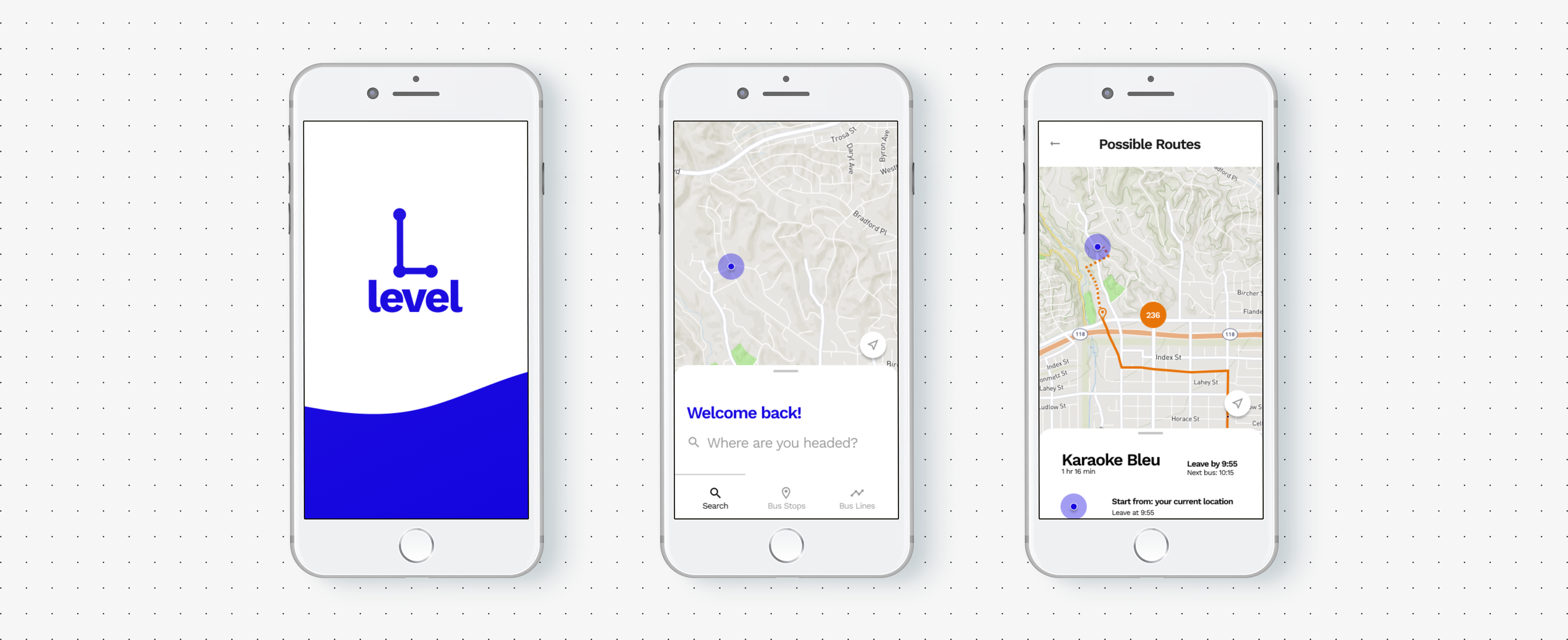
Level is a bus navigation app developed over a course of four weeks an exercise to integrate and practice user-centered design as well as the double diamond process. The product is shaped around several required features as well as one additional tracking feature per user requests. It is additionally an exercise in branding, and the name "Level" refers to meeting users at "Eye Level". Visual Design decisions were shaped by accessibility standards, rounds of user testing and an attempt to convey themes of empathy and altruism.
Scope and Constraints
• Timeline: 4 weeks
• Budget: pro bono
• Timezone: facilitated and met with people in Central and Eastern Time.
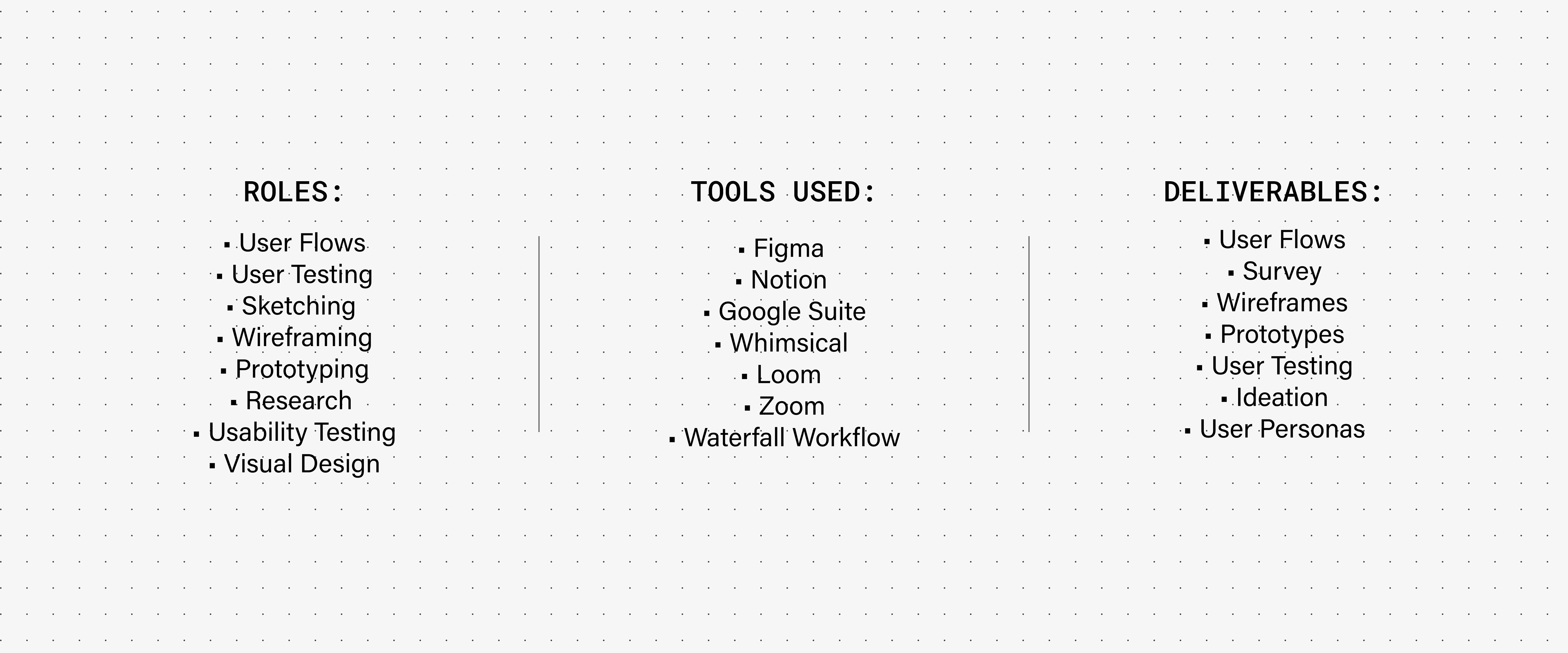
• Tools Used: Figma, Notion, Google Suite, Whimsical, Loom
• Budget: pro bono
• Timezone: facilitated and met with people in Central and Eastern Time.
• Tools Used: Figma, Notion, Google Suite, Whimsical, Loom
Creative Direction:
Alisa Le, Monica Longmire
Problem Statement
Problem
A transportation agency for a midsize metropolitan area has updated their infrastructure. Unfortunately the new changes have broken commuters previous mental models and methodologies of taking the bus. Specifically, riders are often boarding the wrong bus at Washington and State which used to serve one bus line but has now updated to seven bus lines.
Project Requirements
The client has requested that the minimum viable product meet three requirements. Namely the deliverable prototype must:
• Ensure that any rider can tell when each of the buses arrives at the Washington & State bus stop.
• Ensure that all riders can tell how much time they have to get to the Washington & State bus stop before the bus they need arrives at that stop.
•Allow riders to select one of seven bus lines to see a list of its future arrival times at the Washington & State bus stop.
Once these main problems were solved it was within scope to implement one additional feature. I chose to build out a tracking feature on the map based on insights from user interviews.
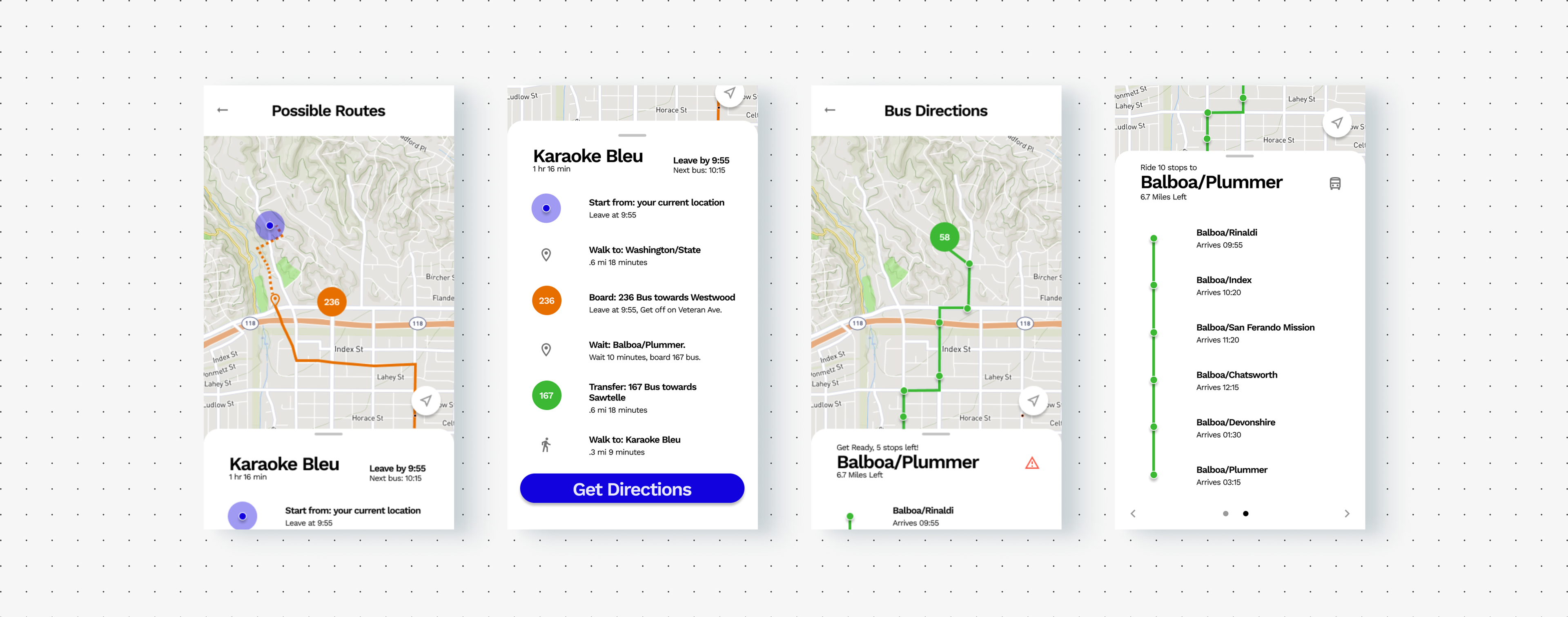
Level | LIVE PROTOTYPE
Solution
PROCESS | DISCOVER
Users and Audience
• Students
• Younger Professionals
• Essential Workers
• Seniors
• Public Transit Enthusiasts (...we exist!)
• Younger Professionals
• Essential Workers
• Seniors
• Public Transit Enthusiasts (...we exist!)
Research:
My research plan consisted of sending out a user survey which gathered demographic info as well as possible qualitative data regarding commuters experiences and needs. Out of 30 survey participants I was able to conduct 3 follow up user interviews and conduct 3 rounds of usability testing. Additionally, I conducted a SWOT analysis of several existing products to identify patterns, unique features and potential areas to explore or iterate off of.
Survey Questions:
• do you have any experience with ride share apps?
• do you have any experience with current public transit apps?
• are there any public transit apps you favor?
• how do you plan your commute?
• has existing infrastructure failed or disappointed you?
• do you have any experience with current public transit apps?
• are there any public transit apps you favor?
• how do you plan your commute?
• has existing infrastructure failed or disappointed you?
User Interviews
After the survey I facilitated follow up interviews on 08/20 and 08/21 with potential users. I strived to be an active listener and keep the tone of the interviews conversational and fun.
In retrospect, I wish scope and resources allowed for me to conduct user interviews from a more diverse age demographic, however I was fortunate enough to have had 2/3 of my interviewees being commuters from the midwest. Insights from these sessions allowed me to identify pattern's and develop personas.
In initial interviews I asked users to walk through their routine or lack there of for a potential commute. Additionally I asked them how they would navigate scenarios similar to the user's in the project brief (As seen below).
Questions Asked:
• Can you describe how you plan and go through your daily commute?
• What application do you use to plan your commute?
• Do you plan your commute in advance or on the day of?
• What features does the app have that stand out to you?
• Are there any features your current go to application is missing?
Insights
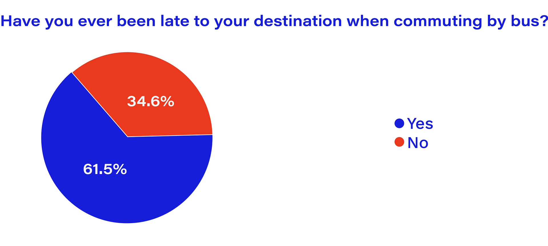
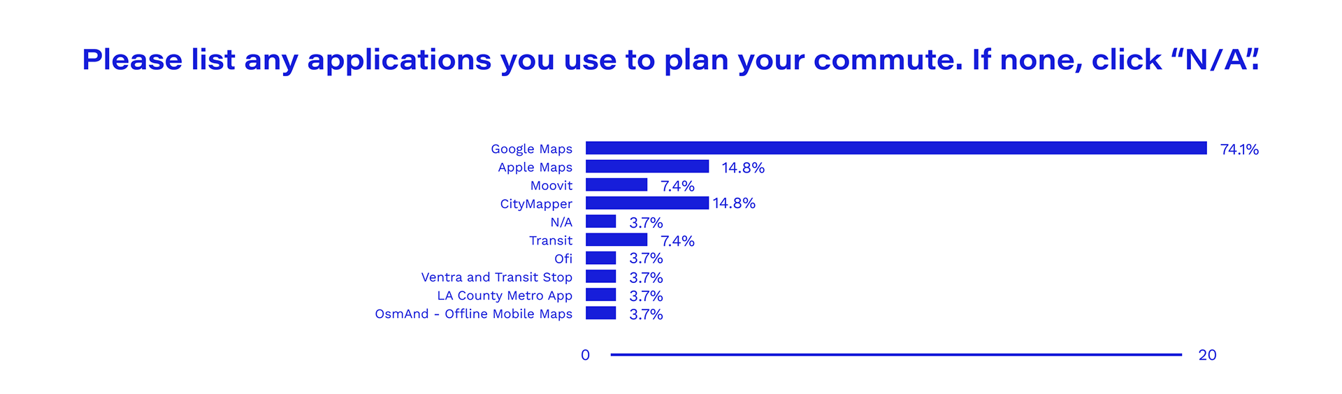
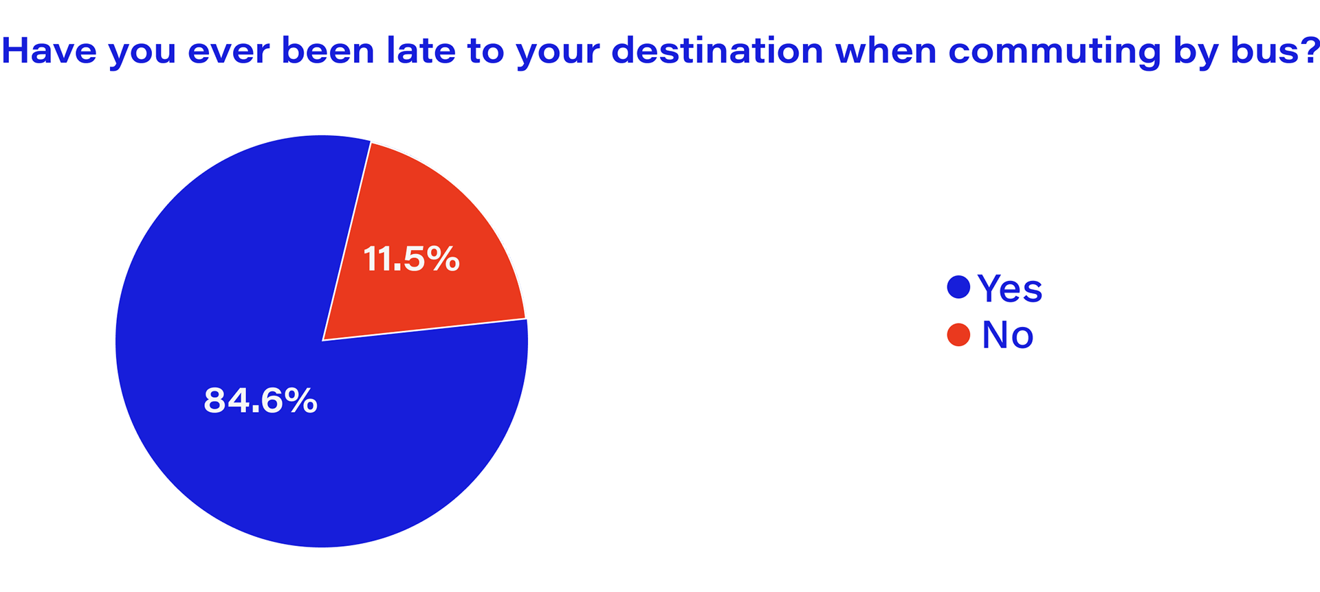
Interviewees faced a number of challenges in their daily commutes and expressed feelings of anxiety when commuting by bus. Common patterns that emerged were commuters often boarded the wrong bus, the bus itself drove past users as well as the bus would sometimes change routes after a user boarded. Additionally, every interviewee expressed an affinity for commuting by their city's subjective subway or train systems. In situations where commuting by bus fell through users would often rely on mental models to navigate their city's subway or train systems to get them to work safely. Lastly, users would use Google Maps to plan their commute usually within the hour of their departure.
SWOT: CityMapper
After interviews and surveys I drew up a competitive analysis to pull insights and strategize from scrutinizing existing solutions.
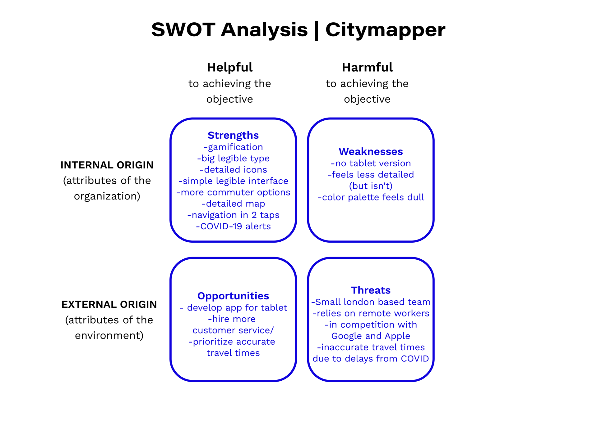
Strengths
Weaknesses
• Gamification
• Big legible type
• Detailed icons
• Simple legible interface
• More commuter options
• Detailed map
• Navigation in 2 taps
• COVID-19 alerts
• Big legible type
• Detailed icons
• Simple legible interface
• More commuter options
• Detailed map
• Navigation in 2 taps
• COVID-19 alerts
• No tablet version
• Feels less detailed (but isn’t)
• Branded green color evokes feelings of tension.
• Feels less detailed (but isn’t)
• Branded green color evokes feelings of tension.
Opportunities
Threats
• Develop app for tablet
• Hire more customer service.
• Prioritize accurate travel times
• Hire more customer service.
• Prioritize accurate travel times
• Small London based team
• Relies on remote workers
• In competition with Google and Apple
• Inaccurate travel times due to delays from COVID damaging reputation.
• Relies on remote workers
• In competition with Google and Apple
• Inaccurate travel times due to delays from COVID damaging reputation.
SWOT: Google Maps
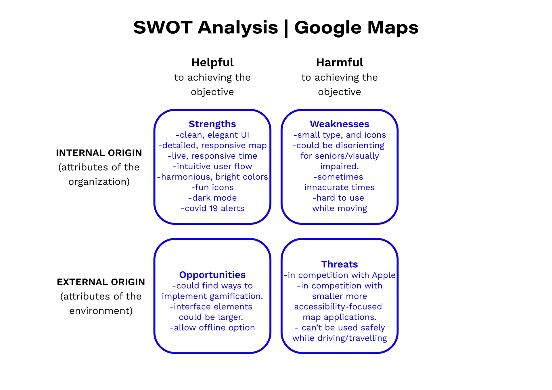
Strengths
Weaknesses
• Clean, elegant UI
• Detailed, responsive map
• Live, responsive time
• Intuitive user flow
• Harmonious, bright colors
• Fun icons
• Dark mode
• Covid-19 alerts
• Detailed, responsive map
• Live, responsive time
• Intuitive user flow
• Harmonious, bright colors
• Fun icons
• Dark mode
• Covid-19 alerts
• Small type, and icons
• Could be disorienting for seniors/visually impaired.
• Sometimes inaccurate times
• Hard to use while moving
• Could be disorienting for seniors/visually impaired.
• Sometimes inaccurate times
• Hard to use while moving
Opportunities:
Threats:
• Could find ways to implement gamification
• Interface elements could be larger
• Allow offline option
• Interface elements could be larger
• Allow offline option
• In competition with Apple
• In competition with smaller more accessibility-focused map applications
• Can’t be used safely while driving/traveling
• In competition with smaller more accessibility-focused map applications
• Can’t be used safely while driving/traveling
PROCESS | DEFINE
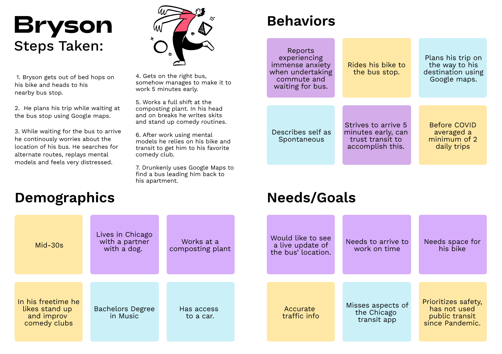
User Personas
I chose to highlight the persona's Rachel and Bryson as they were developed using insights from users who worked and studied in the Midwest and commuted by bus.
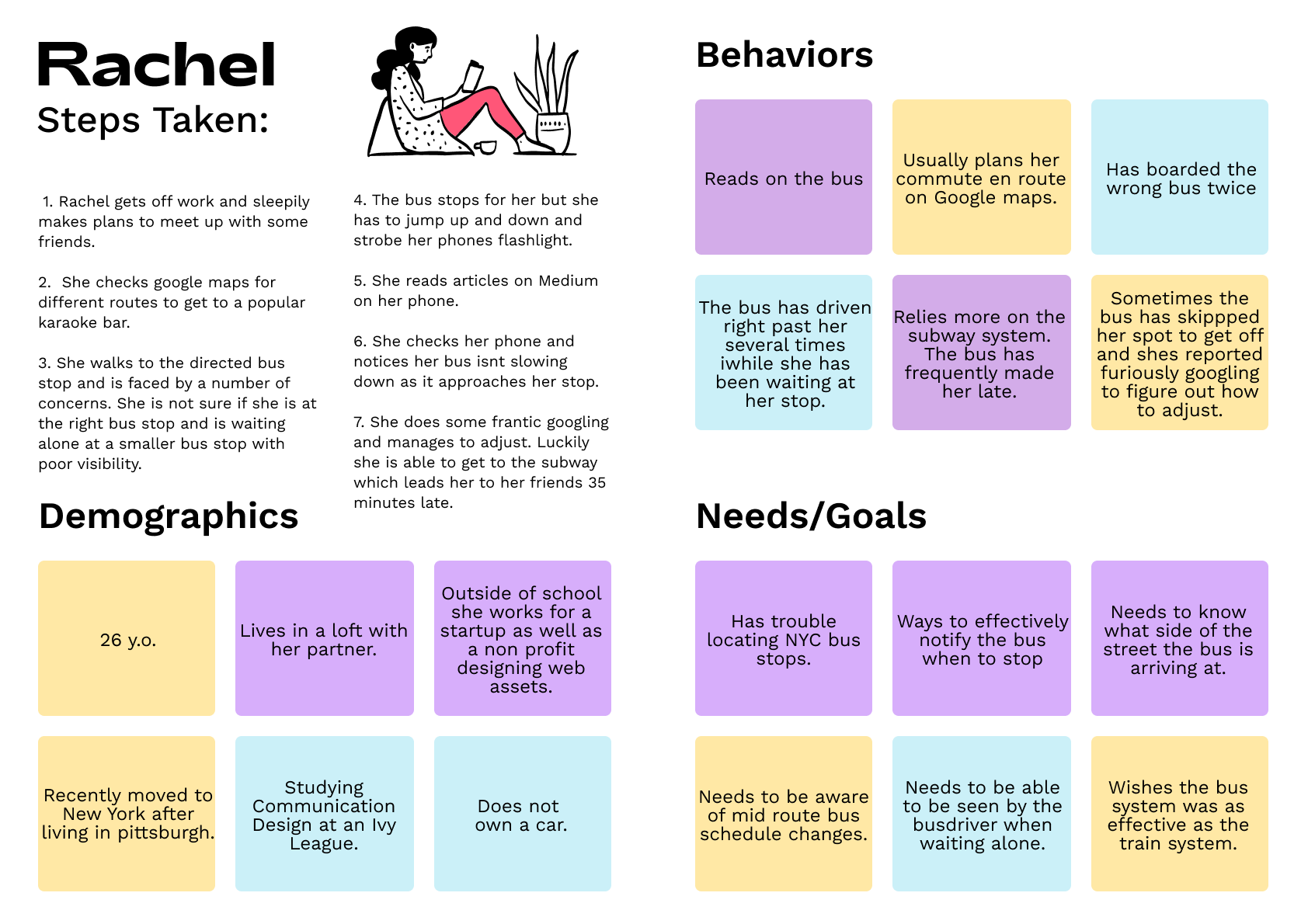
Insights:
• Rachel indicated the bus had driven straight past her on several occasions.
• Additionally the bus had changed routes immediately after she boarded leading to frantic googling.
• Additionally the bus had changed routes immediately after she boarded leading to frantic googling.
Empathy Maps
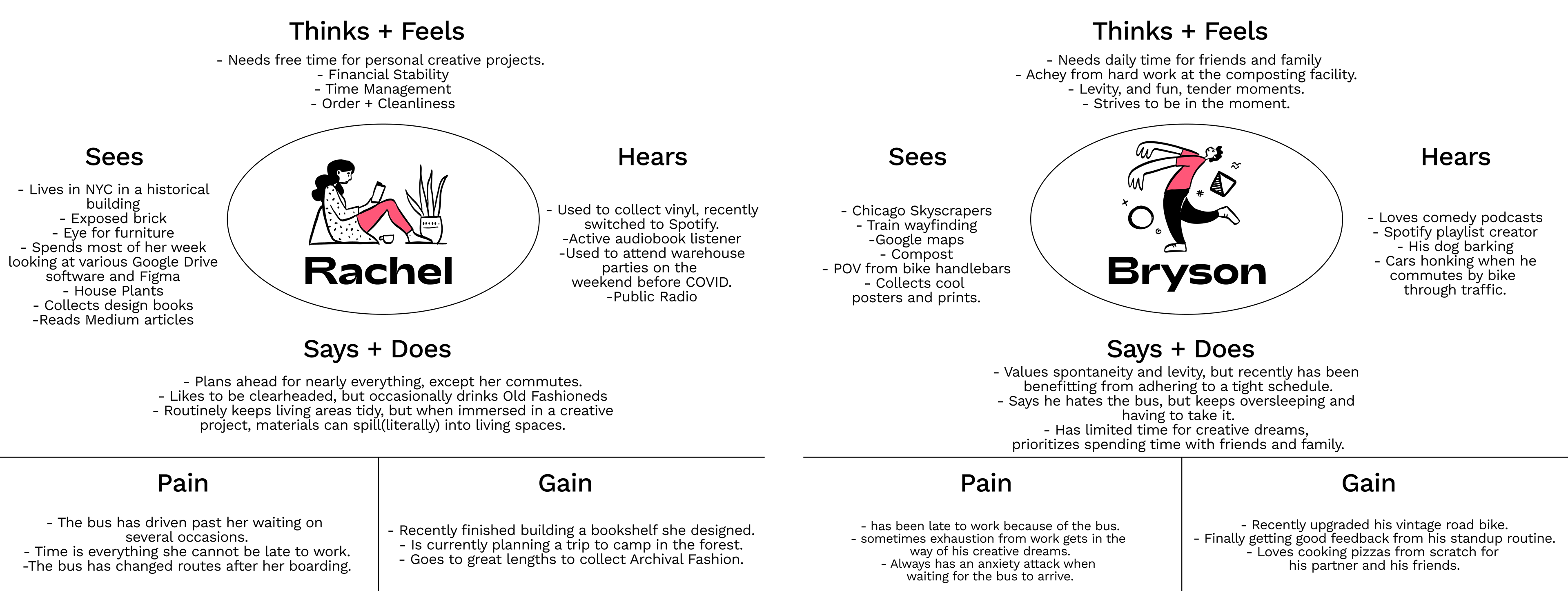
Insights:
• Bryson mentioned he severe anxiety regarding planning his commute.
• His livelihood is directly affected by the inaccuracies of the bus schedule.
• His livelihood is directly affected by the inaccuracies of the bus schedule.
User Journey:
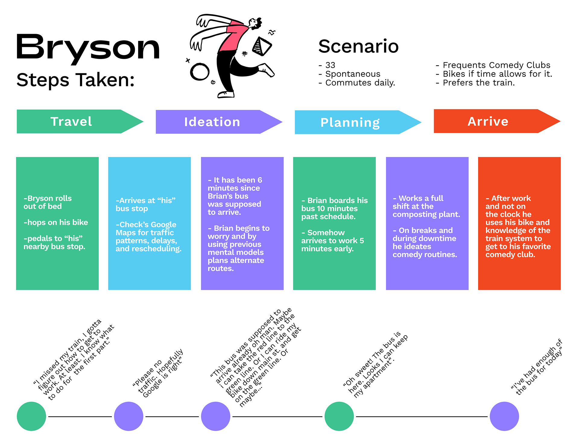
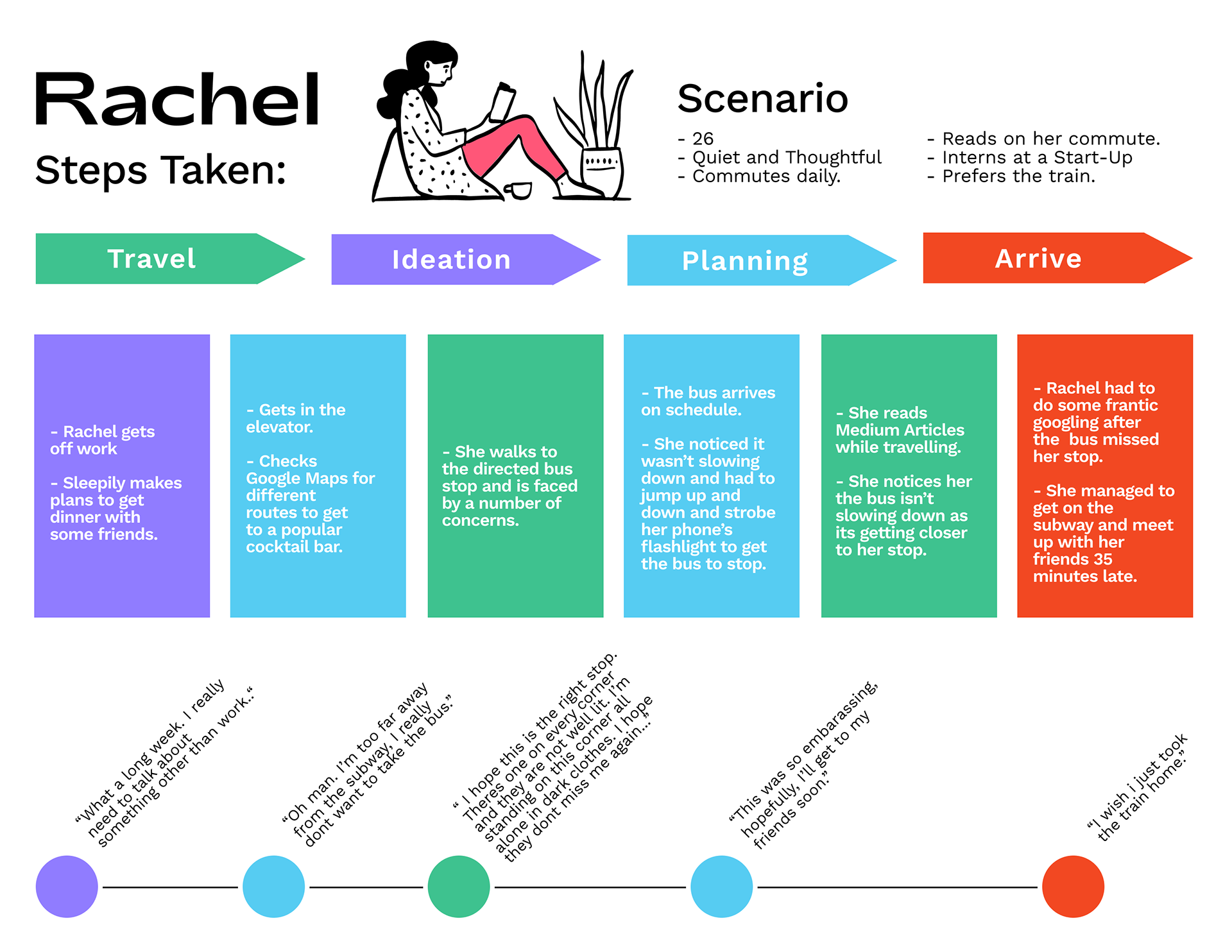
Journey Map Insights:
• Both users felt a sense of dread and unease when relying on the bus.
• They voiced a sense of relief and felt they could always count on the subway or train systems.
This exercise helped me to empathize with the experiences of the potential user and infer what their needs, preferences and wants would be.
• They voiced a sense of relief and felt they could always count on the subway or train systems.
This exercise helped me to empathize with the experiences of the potential user and infer what their needs, preferences and wants would be.
Every User:
• preferred taking the train and viewed it as effective.
• needed to know the live location of the bus.
• needed to be able to plan their commute with short notice.
• needed to know the live location of the bus.
• needed to be able to plan their commute with short notice.
User Stories:
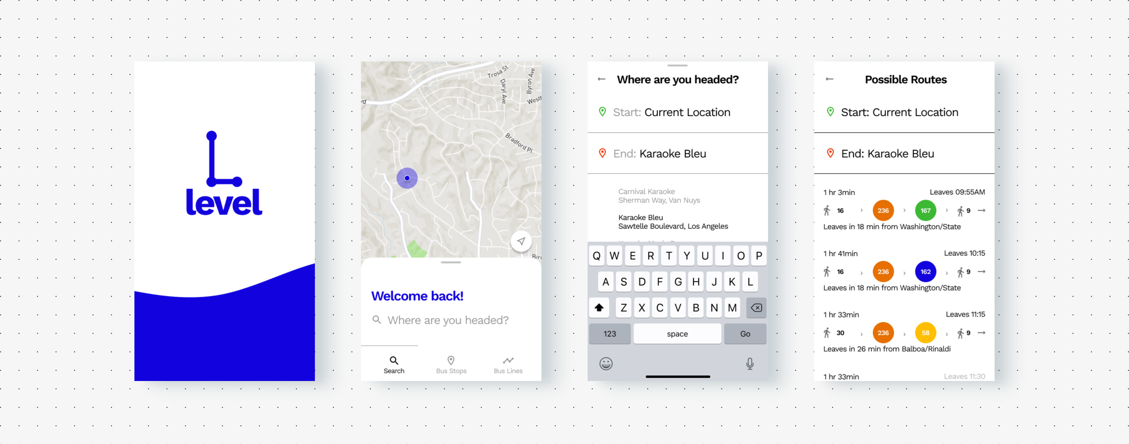
• As Rachel I have familiarity with the app, but have started working and living in a new city. I would like to take the bus after work to meet some friends at a popular Karaoke bar."
• As Bryson I would like to check the schedule for the day at my nearest stop.
The story I ended up prioritizing was Rachel's, a mid 20's start up employee who just moved to a new city. Her need for a search function informed the primary architecture of the product. Additionally, the users that inspired Rachel's persona had the most bandwidth to conduct interviews and user testing.
User Flow
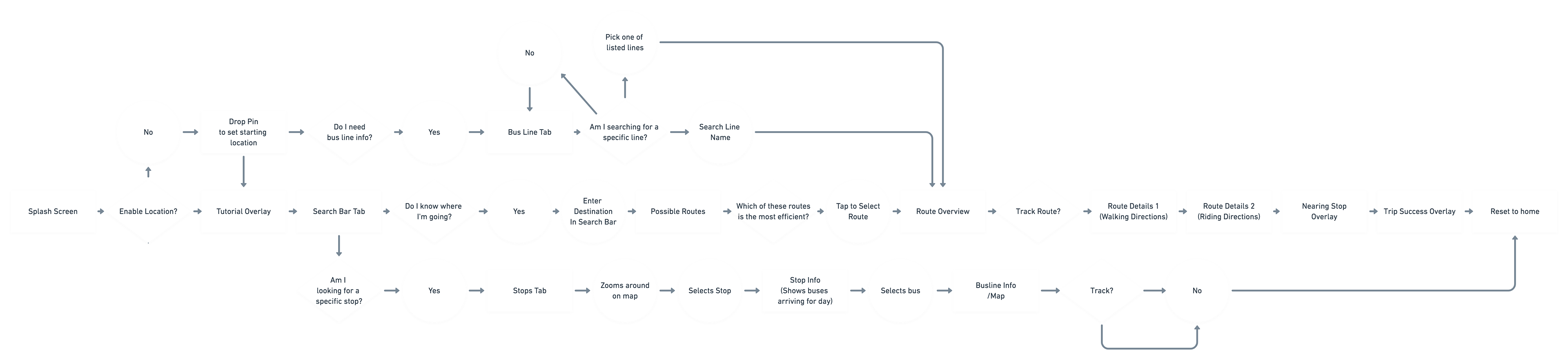
I built off of initial requirements and integrated the aforementioned user stories to plan around the needs of potential users. Additionally I integrated a track feature inspired by Rachel's pain points as she felt she needed more notifications as to her progress on her commute.
Process | DEVELOP
Wireframe Sketches
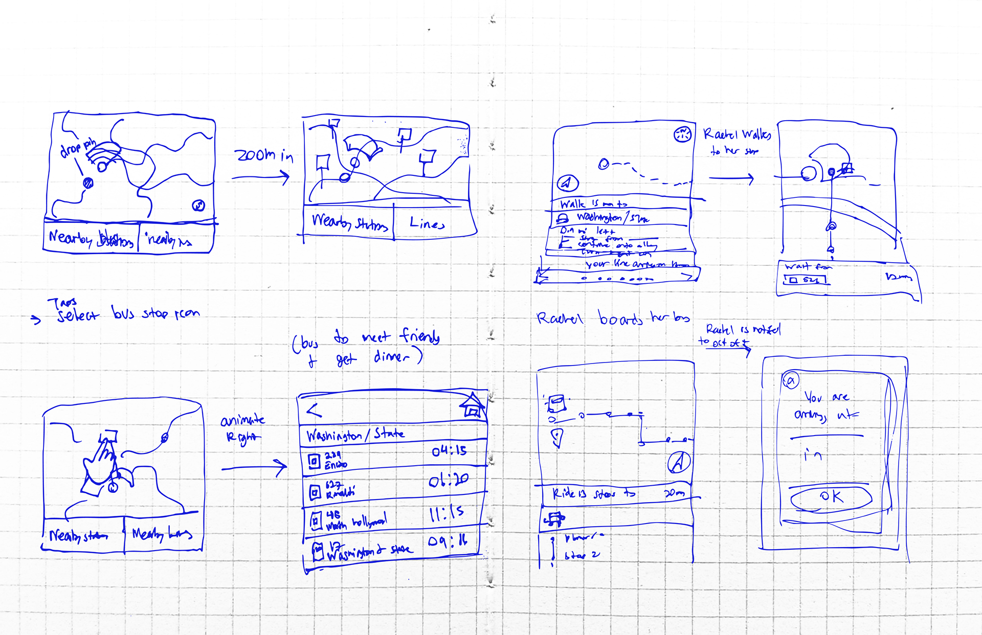
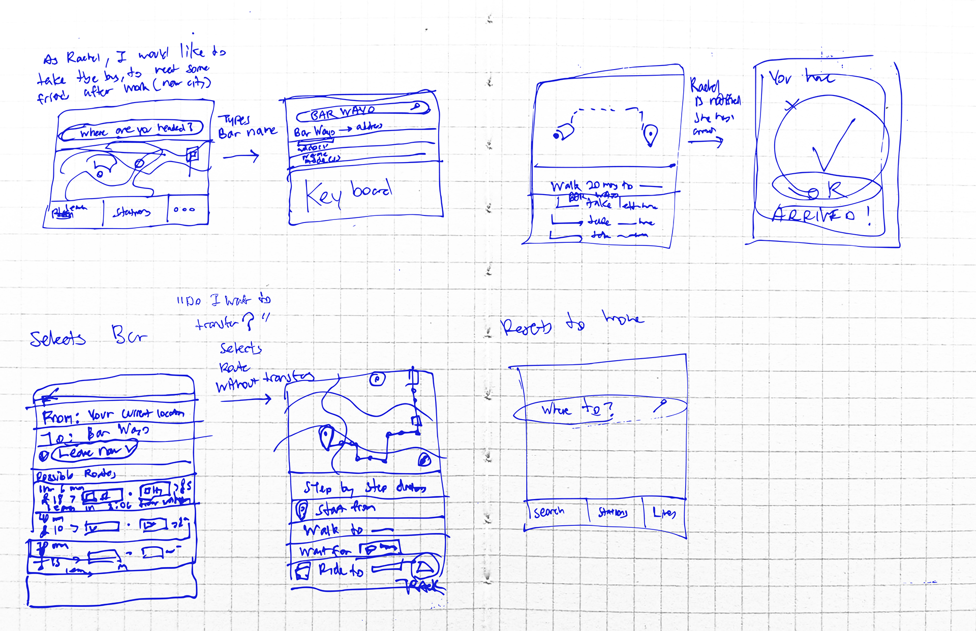
Four up sketches I created to ideate possible features informed by user stories. Sketching helped me to to quantify which screens were needed and begin to develop information architecture.
After sketches I moved on to iterating various digital wireframes. From creating digital wireframes I was able to test and iterate through possible information architecture and features based off of user needs and pain points. For each user I instructed the interviewee to interact with the product in context to several scenarios. The scenarios I tested reflected project requirements and were as follows:
After sketches I moved on to iterating various digital wireframes. From creating digital wireframes I was able to test and iterate through possible information architecture and features based off of user needs and pain points. For each user I instructed the interviewee to interact with the product in context to several scenarios. The scenarios I tested reflected project requirements and were as follows:
Scenarios Tested:
Scenario 1: User has moved to a new city and would like to get drinks with friends after work.
Scenario 2: Its the weekend, user is not on a time constraint would like to check their nearby stop and see the daily schedule
Scenario 3: User would like to find a line that takes them to an area they already know of and enjoy.
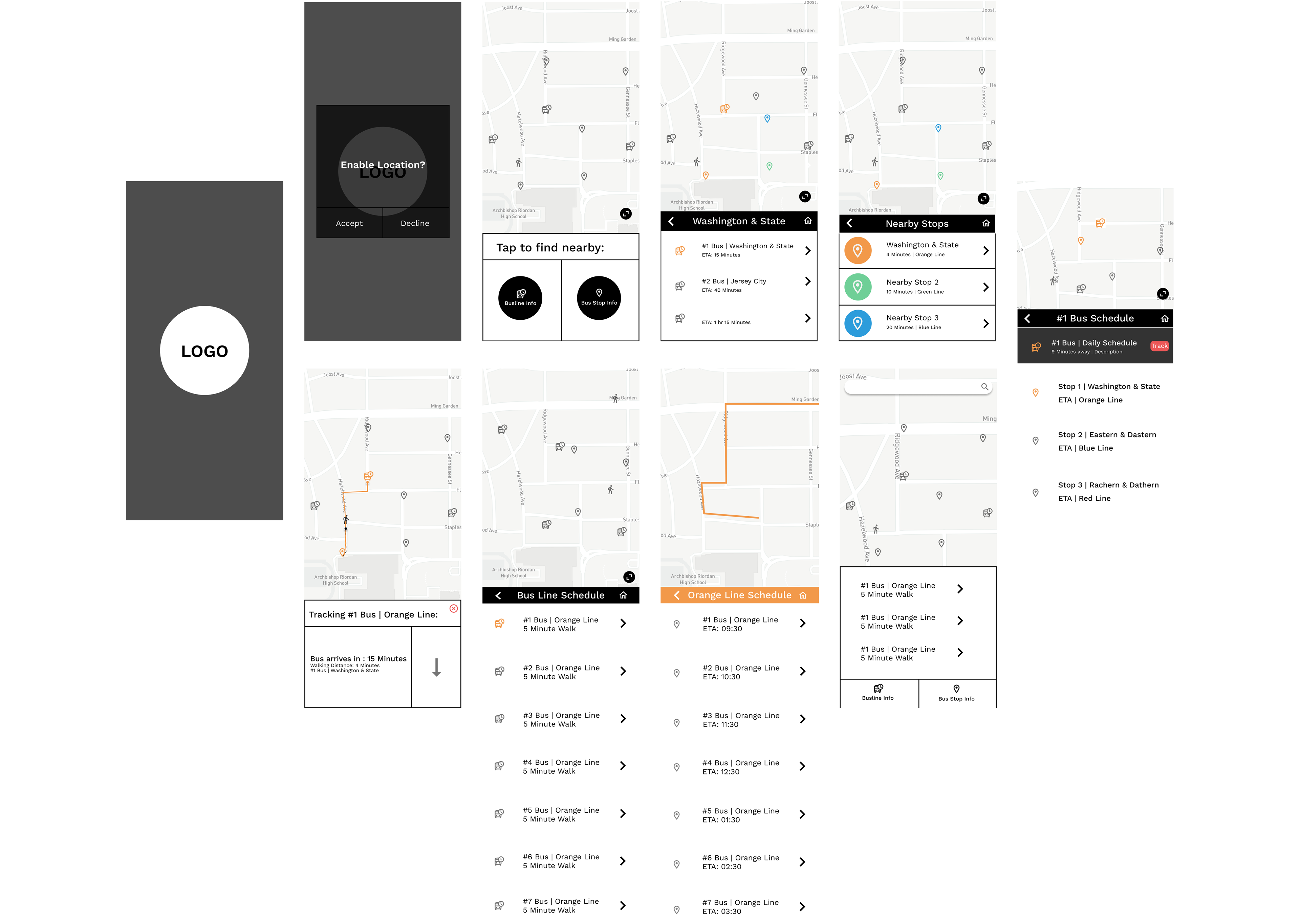
Wireframes V1
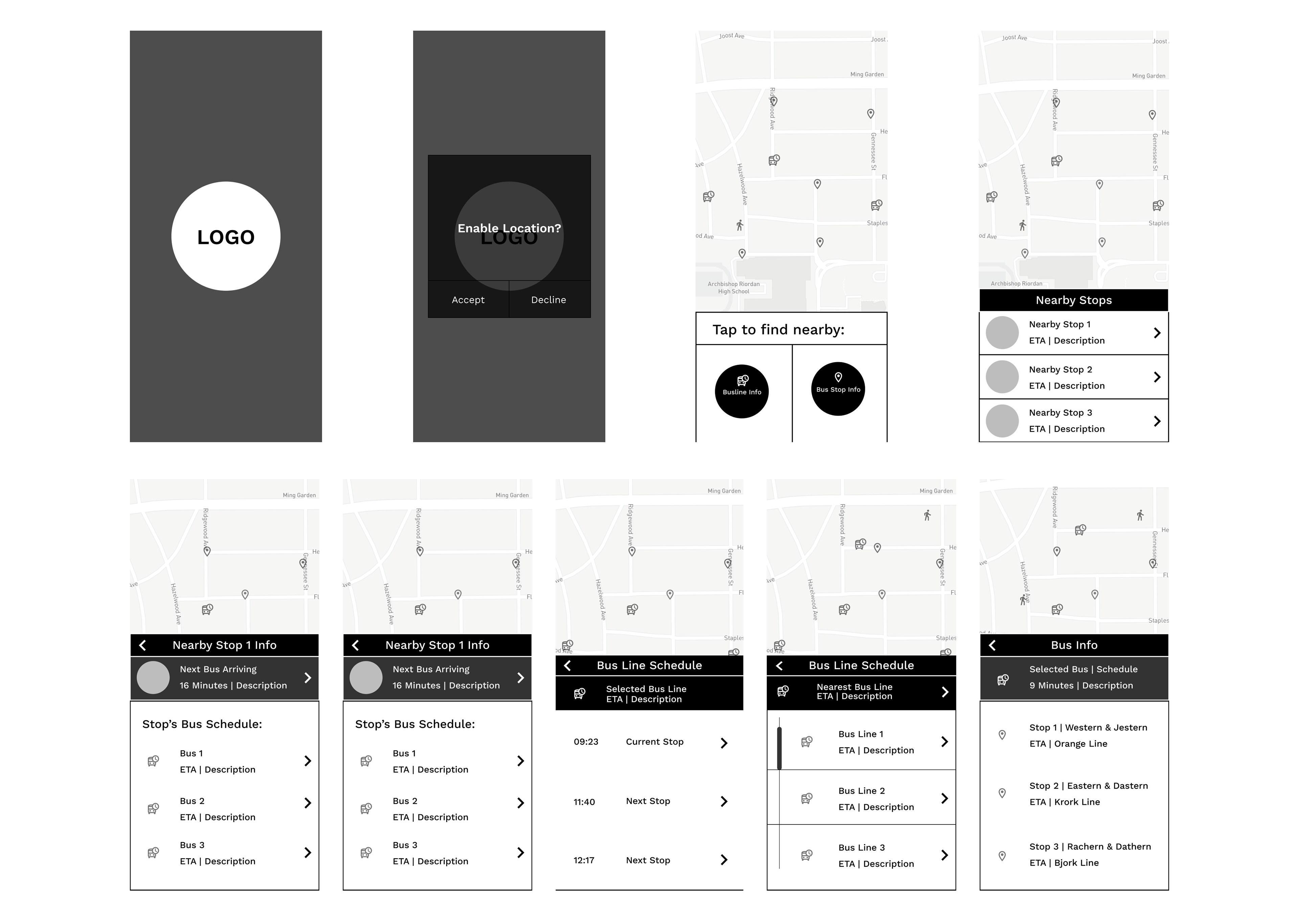
In user testing it was recommended that I could add tabs per each intended user flow. Additionally users felt they had trouble identifying hierarchies of bus information without color coding. A big issue with this prototype was there was no flow for users that did not want to enable location.
Wireframes V2
User's felt frustrated by the lack of collapsible way-finding information. Additionally, they recommended implementing progressive disclosure to prioritize the map screens, as well as easing back on color coding until I develop more intuitive information architecture. Additionally, users felt that the prototype could benefit greatly from a search function. The track feature sparked feelings of cognitive dissonance and it's function needed to be more clearly defined.
Lo-Fi Prototype
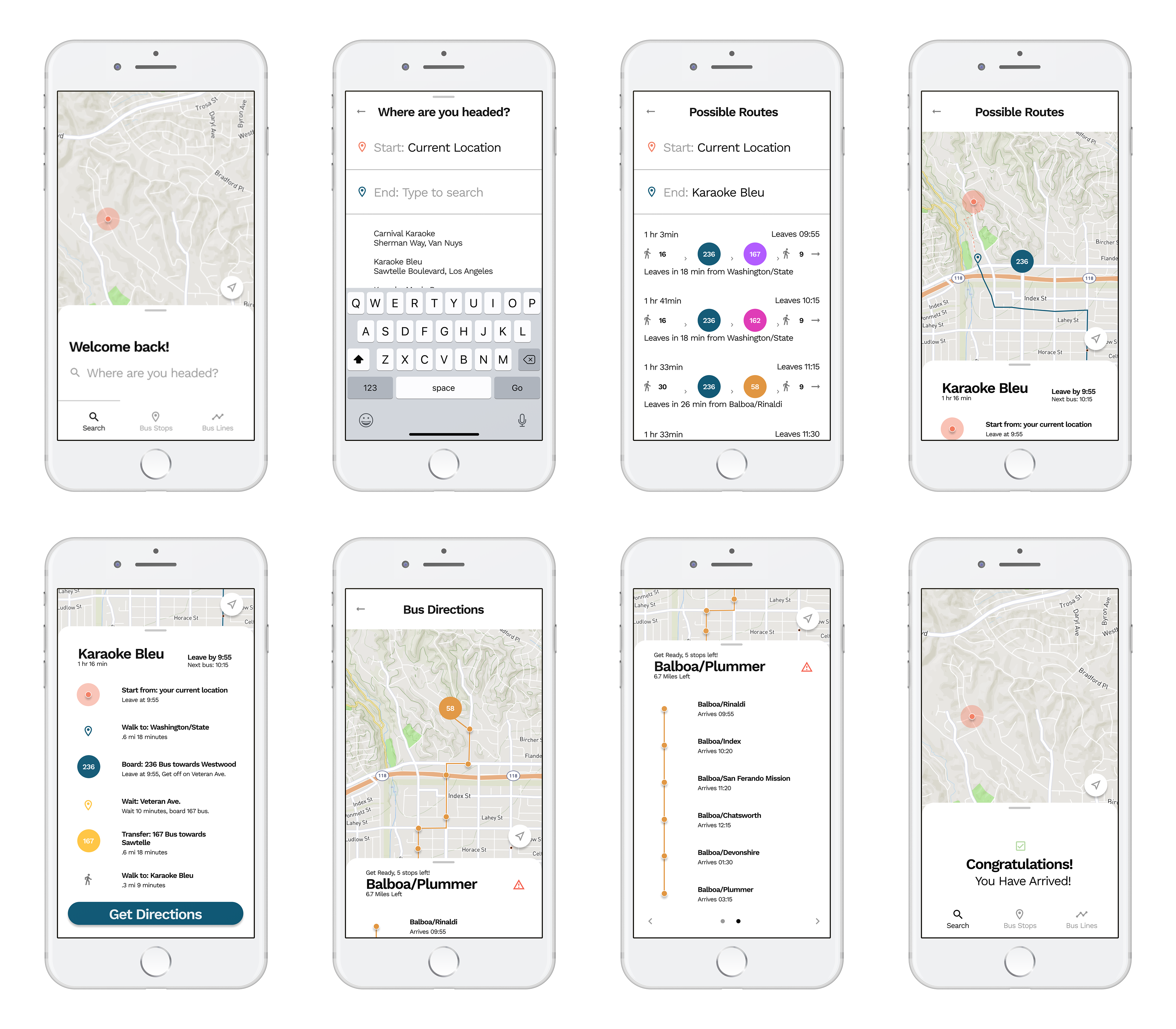
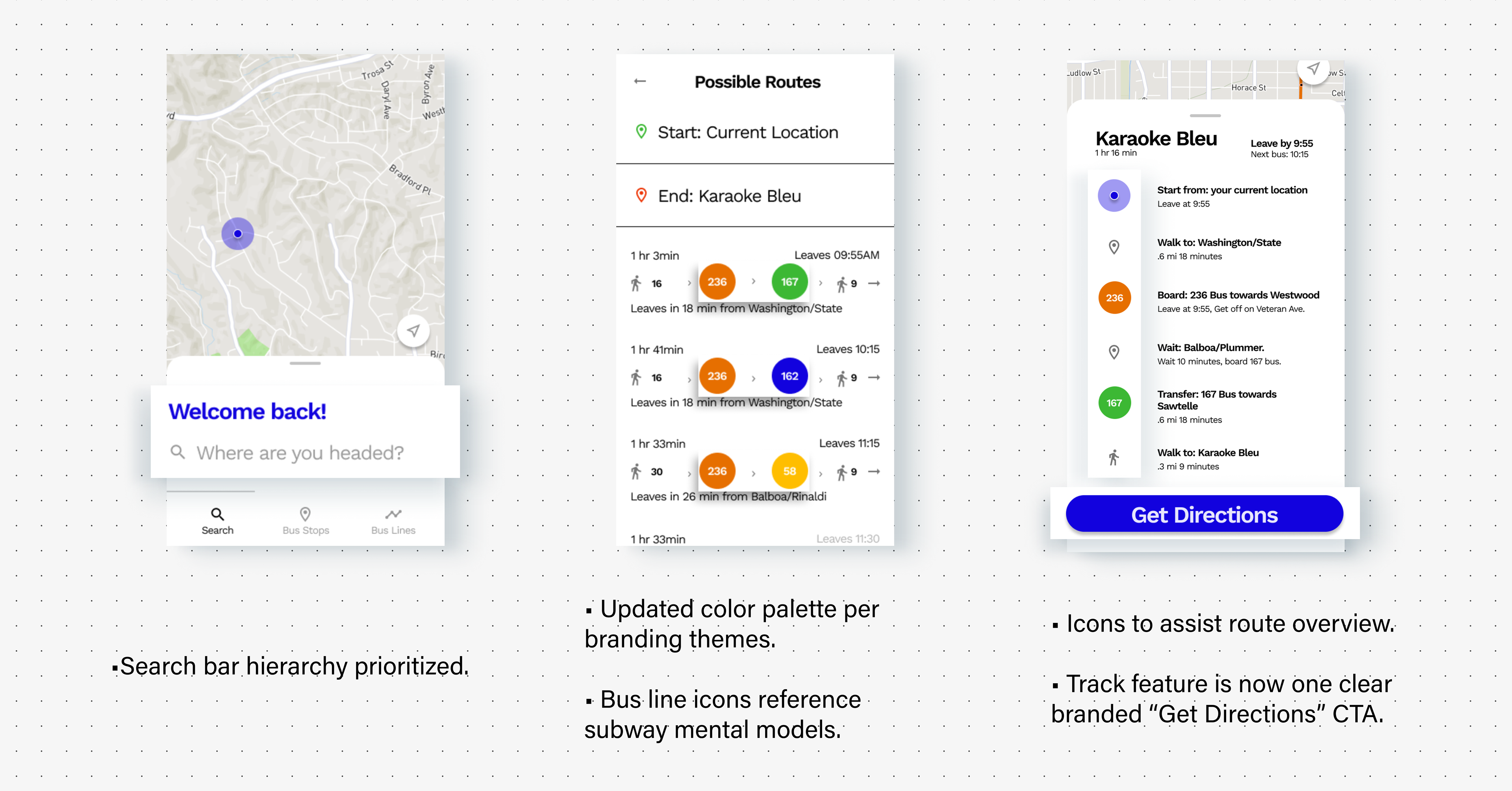
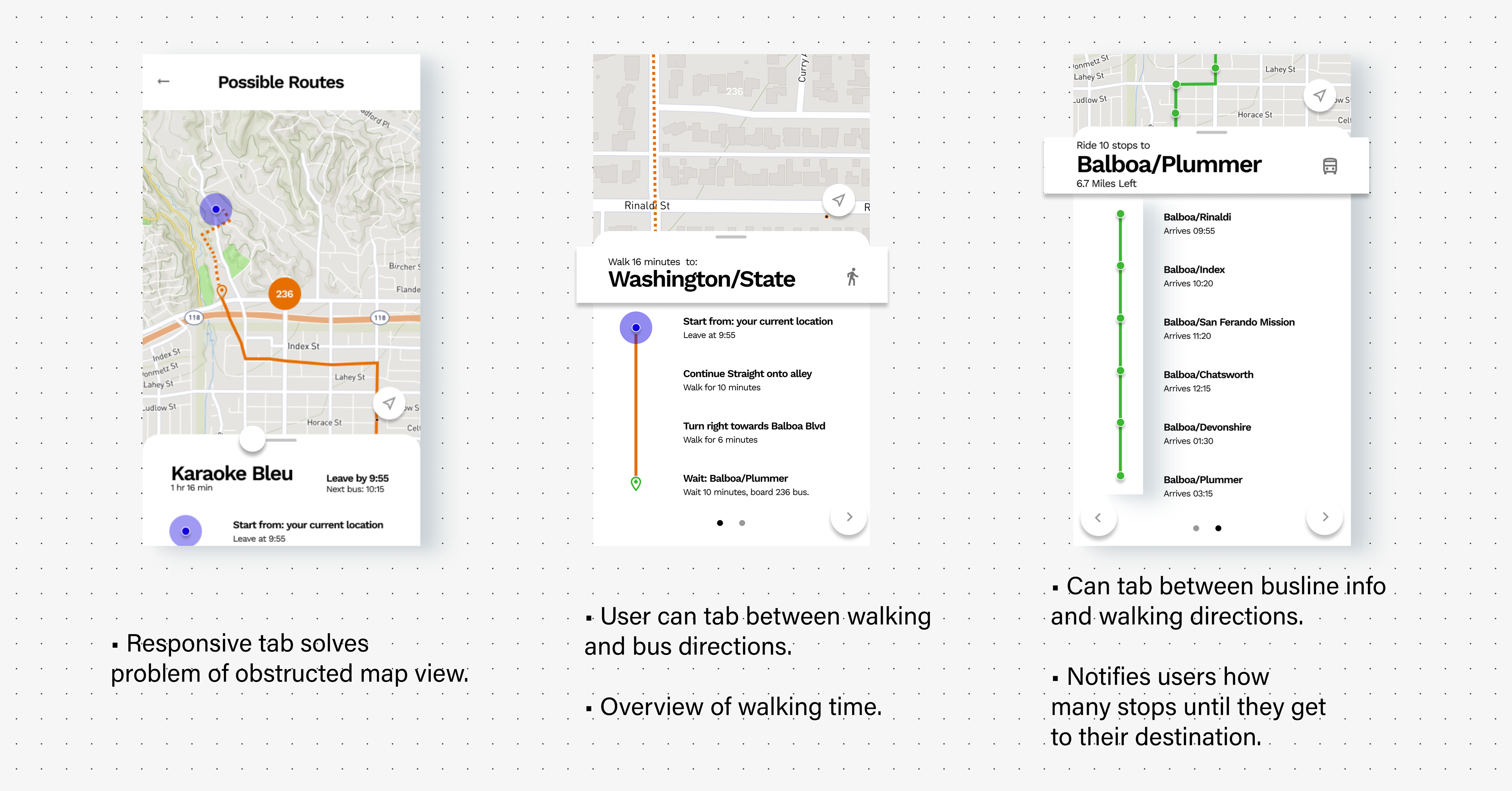
Users recommended I begin color coding bus lines, as well as including quantifiable units in the possible routes screen. They felt more familiarity with this iteration, and found the search feature to be an improvement. User's felt the overlays were a neat idea but were executed ineffectively as they obstructed the user's view of the map. Additional feedback was that the information architecture could benefit from collapsible and responsive container elements. Additionally the track feature was refined to a singular "Get Directions" call-to-action.
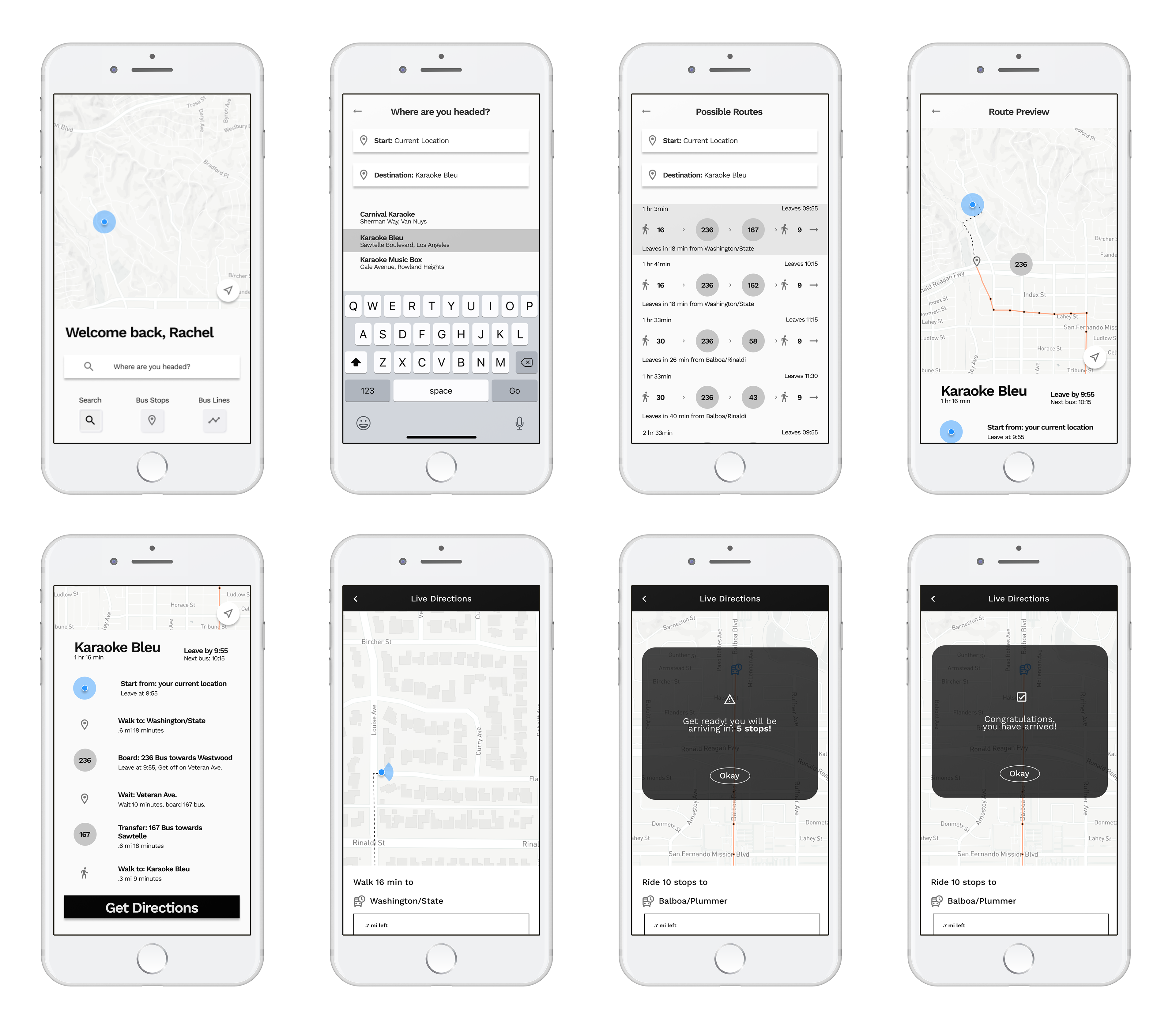
Mid-Fi Prototype
In this iteration I began to develop branding however, in usability testing I got feedback that the color palette felt "stale" and "dated". User's also felt confused about the purposes of the bus stops and bus line's tabs, yet found the main search path effective. Users liked the ability to get walking directions as well as see an overview of all the stops on their commute. After this iteration I was able to focus in on branding decisions as well as make the move to high-fidelity.
Process | DeLIVER
Style Tile:
Moodboard:
Branding Goals:
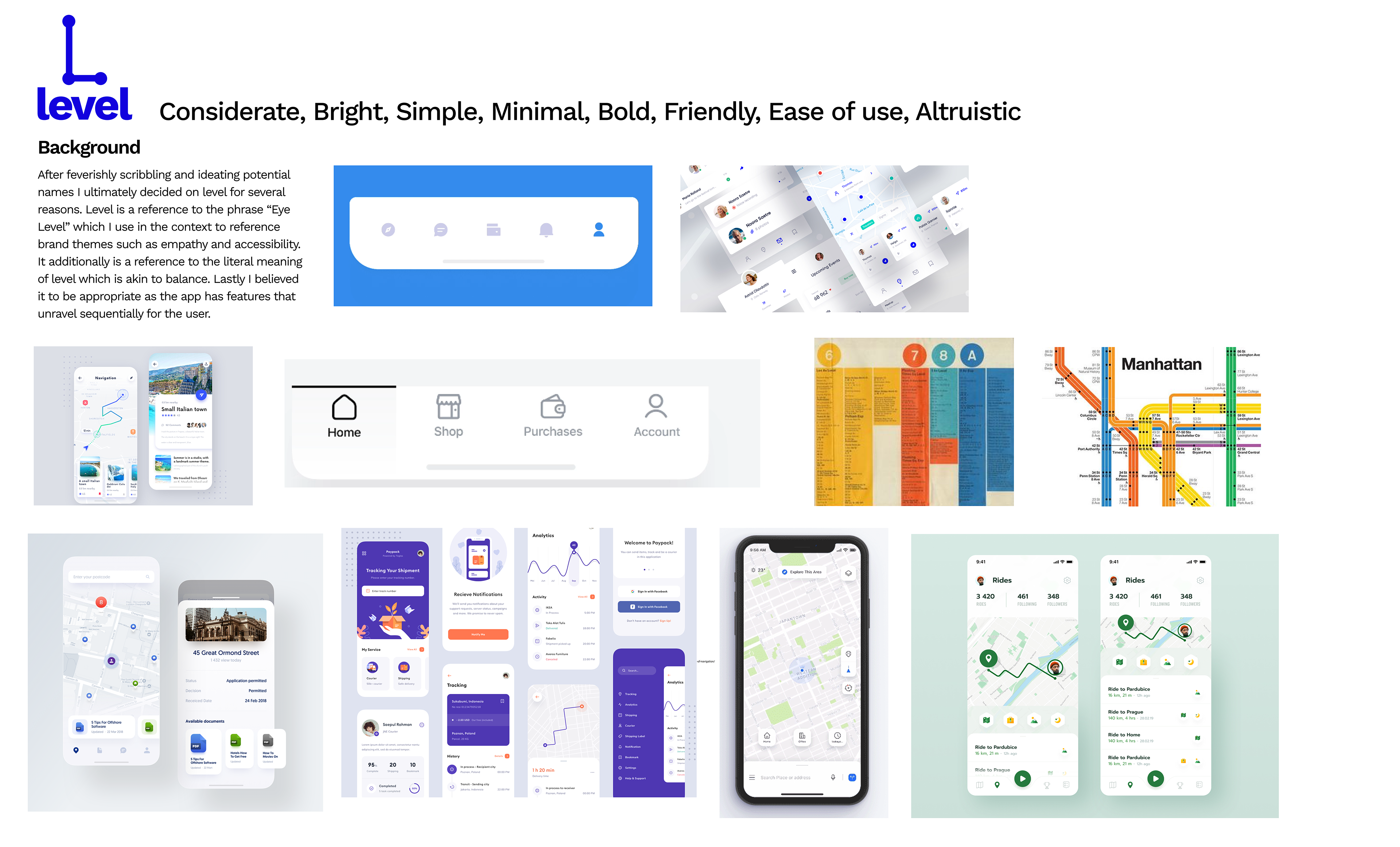
Considerate, Bright, Simple, Minimal, Bold, Friendly, Ease of use, Altruistic
Branding Background:
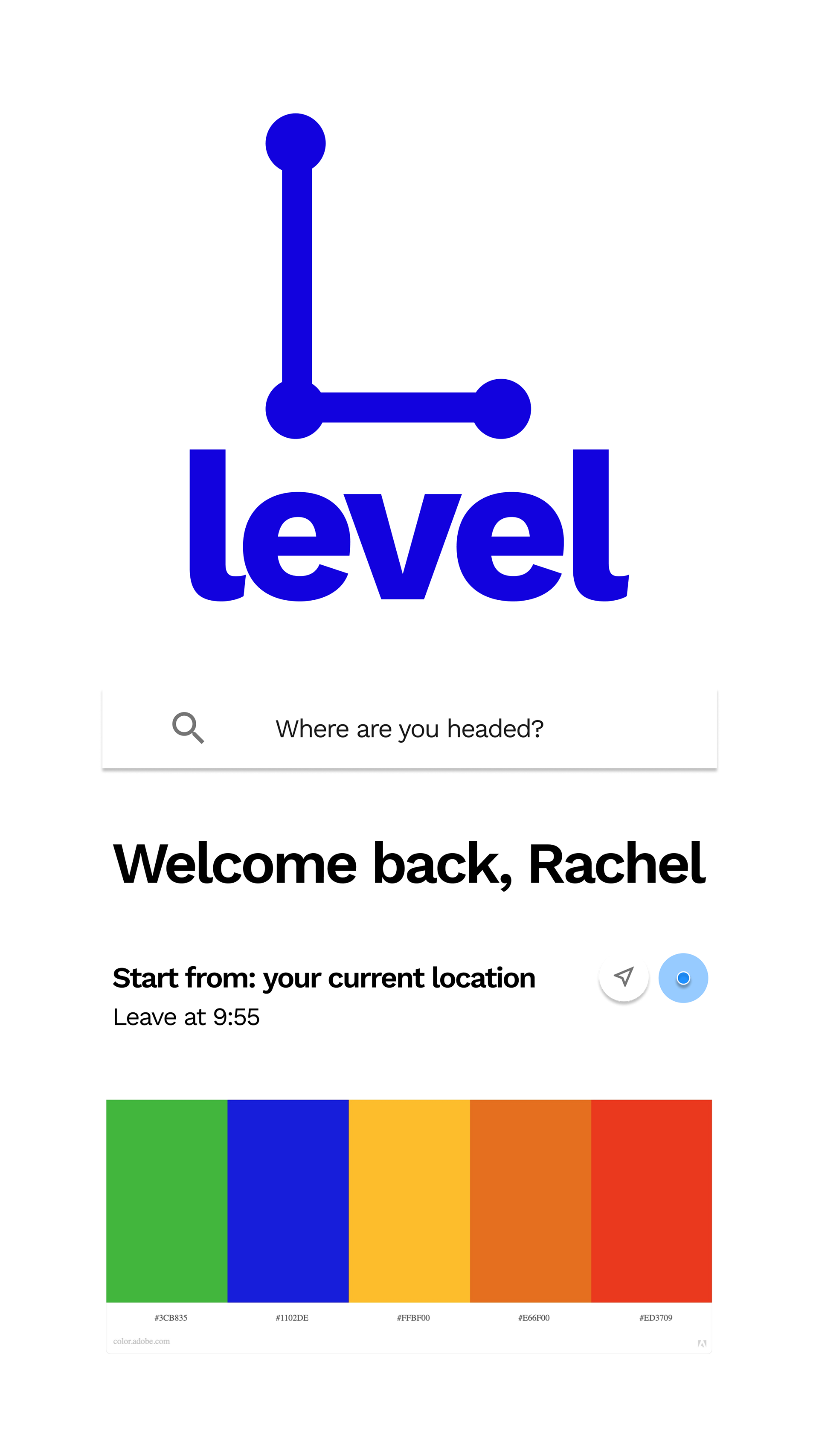
The name, "Level" is a reference to the idiom “Eye Level” as in meeting the user at "Eye Level". It additionally is a reference to the literal meaning of level which is akin to balance. Level is additionally a reference to progressive disclosure, as the app has features that a user must sequentially advance through.
Level | LIVE PROTOTYPE
Usability Reports | QUalitative data
Final Usability Tests:
With this latest iteration I conducted my final round of user testing where I actively listened and took notes, encouraging them to vocalize areas they found frustrating or could be improved as well as identify what features resonated with them. I tested scenarios based off of the project requirements and user stories. The scenarios tested are as follows:
Scenario 1: User has moved to a new city and would like to get drinks with friends after work.
Scenario 2: Its the weekend, user is not on a time constraint would like to check their nearby stop and see the daily schedule
Scenario 3: User would like to find a line that takes them to an area they already know of and enjoy.
The last round of user testing helped me understand what features needed to be improved as well as what decisions were effective.
The last round of user testing helped me understand what features needed to be improved as well as what decisions were effective.
CONCLUSION
Improved:
In my final round of usability tests, user's expressed I had made successful branding decisions. Every user expressed they understood the bus styling as it referenced mental models from public transit in major metropolitan areas. Additionally users found the main search function intuitive.
To be improved:
With that being said users identified a number of pain points and additional features to be improved upon in future iterations:
• Improve UX grammar, check to make sure icons match existing mental models.
• Improve UX grammar, check to make sure icons match existing mental models.
• User's claimed certain features felt redundant and mentioned the app could benefit from either less or more features.
• Users wanted the map to take up more of the screen real estate.
• The search bar is currently the focal point hierarchically, but users felt the map should be primary hierarchy with components nested or designed with this in mind.
• Walking directions felt a little too extensive could be simplified into a collapsible screen to ultimately make the map the key feature.
What I learned:
• Decomposition (Breaking down and finding solutions for a complex problem).
• Mindfulness: Commitment to the process in itself, working and iterating without attachment or expectations.
• User Testing
• Prototyping in Figma
• Information Architecture
• Time Management
• Research
• Mindfulness: Commitment to the process in itself, working and iterating without attachment or expectations.
• User Testing
• Prototyping in Figma
• Information Architecture
• Time Management
• Research