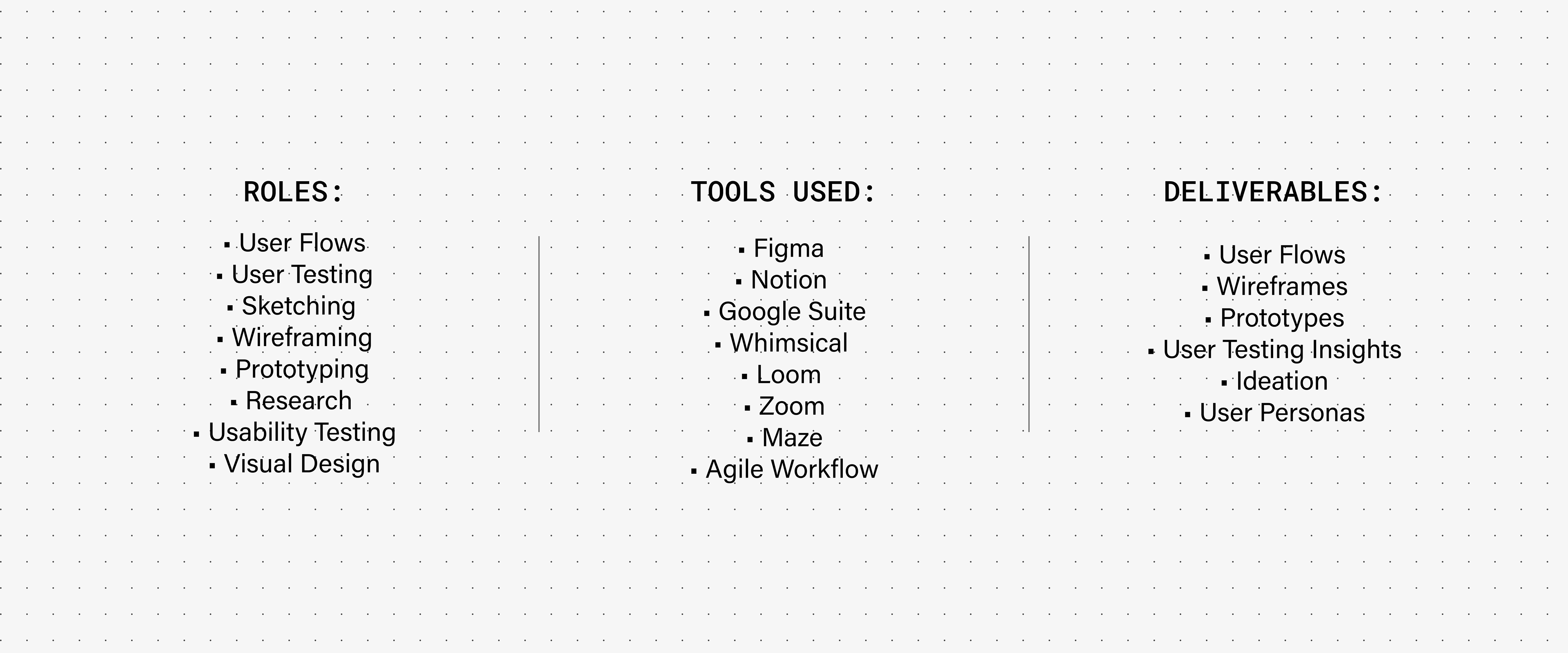
Kyle Johnson
Project Brief:
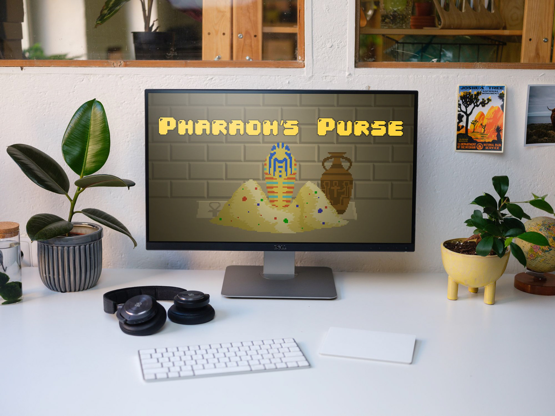
What is Pharaoh's Purse?
A tower defense strategy game, developed by MemeRegime Studios. The user plays as Pharaoh Ramses and has to defend their gold from waves of grave robbers, tourists and federal agents. It has a tone described as both "witty, and 'off-the-cuff' " and is designed in a unique, retro pixel art style. Usability, Accessibility, User Retention and on-boarding were issues with the initial build. MemeRegime lamented that their ineffective UI stemmed from their developer background and lack of resources and were eager for assistance from a small team of scrappy UX/UI students.
Project Requirements
MemeRegime offered us creative freedom as long as deliverables were to be in a Pixel Art style and to reference Ancient Egypt and requested we prioritized the tutorial and help screens.
Scope and Constraints
Timeline: 3 weeks
Budget: pro bono
• Dependent upon developers and pixel artist's timeline(s).
• Coordinated meetings across several different time zones.
• Dependent upon user interviewee schedules.
• Coordinated meetings across several different time zones.
• Dependent upon user interviewee schedules.
Problem Statement:
Problem 1:
Usability, Accessibility, User Retention and on-boarding were being negatively effected by the existing UI.
Problem 2:
MemeRegime is a small developer-minded team. Aside from handling the interconnected complexities of code and game design, they were additionally faced with the daunting task of creating and programming in-game UI. As a result, the initial UI negatively affected the playability, usability and user retention of an otherwise charming and fun game.
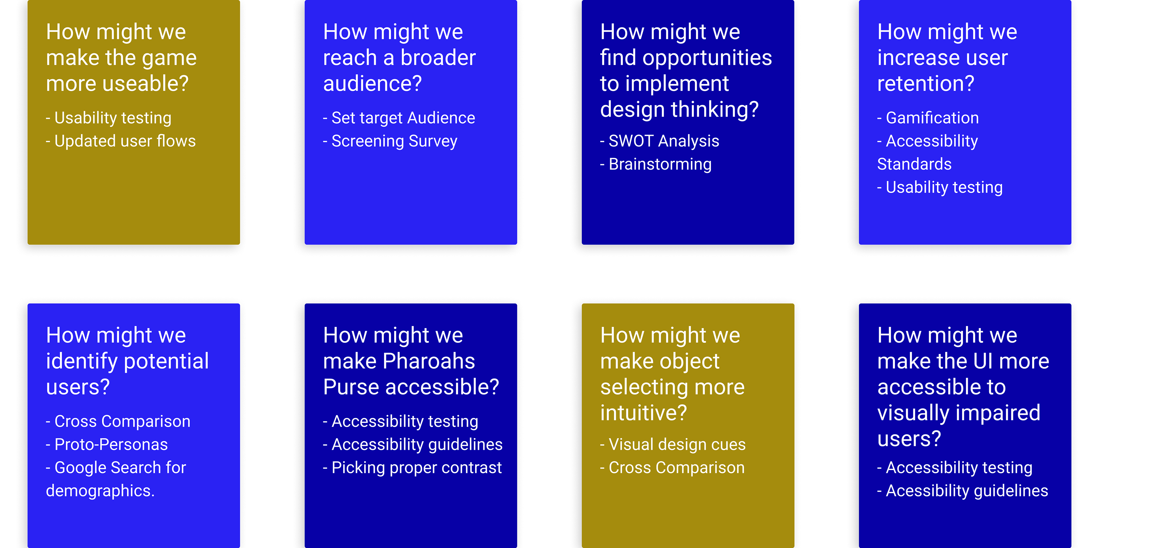
How Might We's?
To identify aspects of Pharaoh's Purse that need to be improved, we ran a how might we exercise where we ideated potential pain points, problem areas and solutions in Pharaoh's Purse. Ultimately, we found a pattern of issues affecting both usability and accessibility, and made a plan using this perspective as the focal point of our problem-solving.
"How might we improve the user's experience by prioritizing usability and accessibility?"
Goals:
• Identify and begin to improve user pain points.
• Conduct an accessibility audit.
• Run as much user testing and A/B analysis as we could within 3 weeks.
• Conduct an accessibility audit.
• Run as much user testing and A/B analysis as we could within 3 weeks.
Potential Users | Target Audience
From correspondence with MemeRegime and our initial survey we were able to ideate a target audience of PC, Web and Mobile gamers in the Millennial and Generation Z demographics. They would be motivated by nostalgia, interested in strategy or indie games and have familiarity with newer games utilizing a pixel art motif.
Pharaoh's Purse: Tower Defense Game | LIVE PROTOTYPE
Solution:
By prioritizing usability and accessibility we were able to improve upon problems with playability and user retention that were negatively affecting the initial build of Pharaoh's Purse. Utilizing human-centered design allowed for the unique content and gameplay mechanics to take center stage.
Process | Discover
Research Methods
Screener Survey
• Screener Survey
• User Interviews
• Competitive Analysis
• A/B Usability Testing
• User Interviews
• Competitive Analysis
• A/B Usability Testing
• Have you played any tower defense games?
• Do you enjoy playing tower defense games?
• Have you played any tower defense games?
• Do you enjoy playing tower defense games?
• Do you enjoy playing tower defense games?
• Have you played any tower defense games?
• Do you enjoy playing tower defense games?
Screener Survey
• Have you played any tower defense games?
• Do you enjoy playing tower defense games?
• Do you enjoy playing tower defense games?
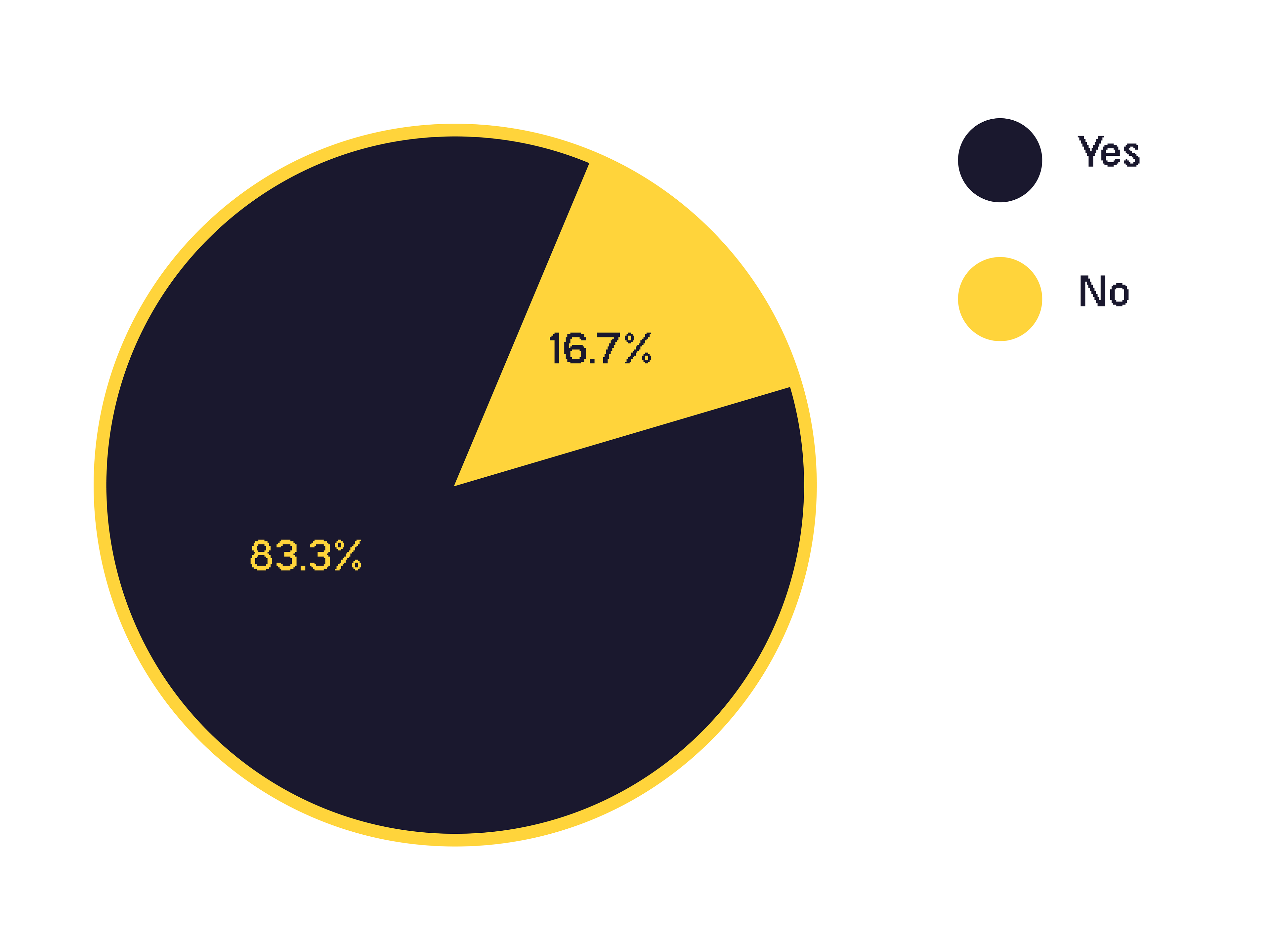
83.3% of participants have experience and enjoy playing tower defense games and expressed having an affinity for unique aesthetics and gameplay. We included demographic questions and utilized this survey to generate a contact list for additional user testing. We were able to generate personas pulled from quantitative data as well as insights pulled from follow-up interviews.
USABILITY TESTING:
Scenarios Tested
Before moving forward we wanted to identify pain points within the existing UI from the initial build of Pharaoh's Purse. We conducted user testing where we observed how users behaved, interacted with and felt towards Pharaoh's Purse's initial UI.
We tested three main tasks per the project requirements:
• Read the story
• Go through the tutorial mode
• Play through eight waves on the first map
We tested three main tasks per the project requirements:
• Read the story
• Go through the tutorial mode
• Play through eight waves on the first map
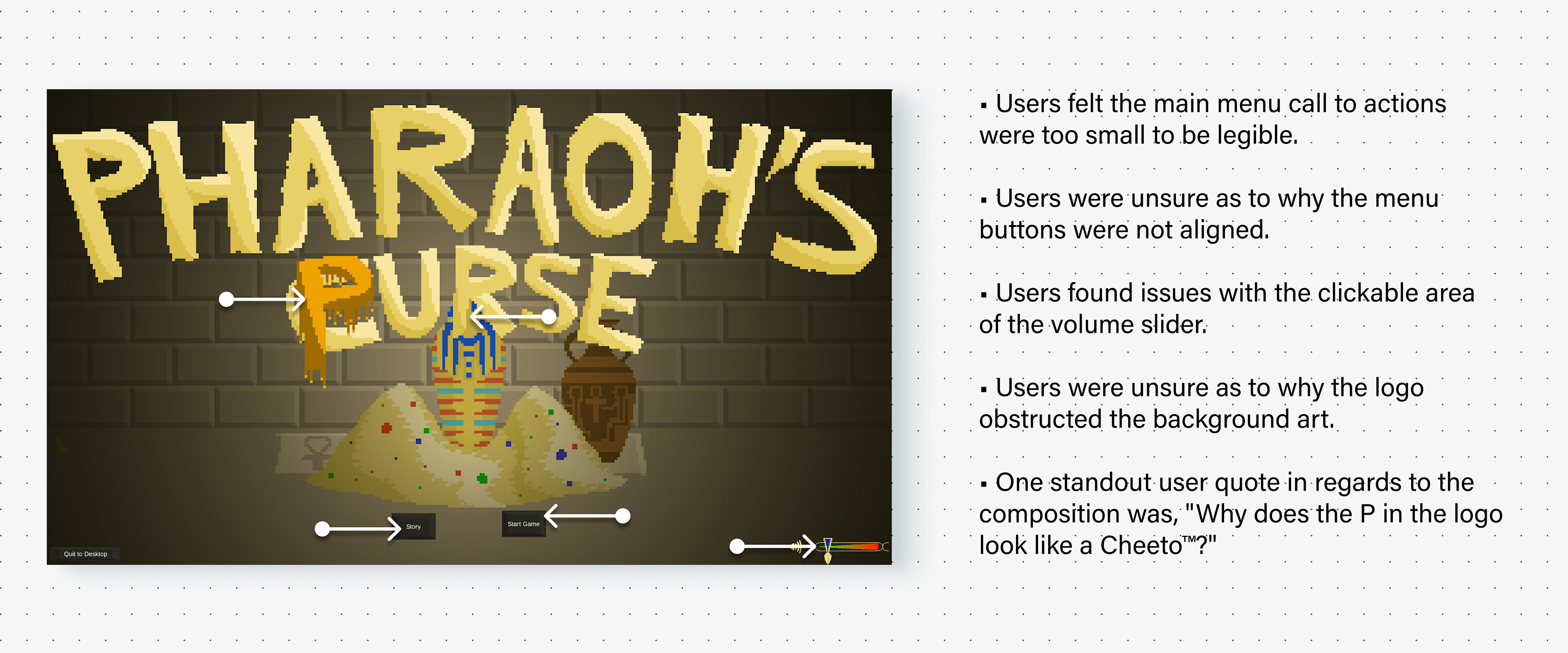
"Why does the P in the logo look like a Cheeto™?"
Followup Interview Questions:
After observing how user's interacted with the initial UI from the web build of Pharaoh's Purse we conducted a follow up interview to further quantify areas of improvement/.
• What is the biggest pain point for you?
• What can be done to improve your experience with the game?
• Did you struggle to determine how to play the game/what the goals are?
• Are there portions of text or areas of explanation you find confusing or that can be simplified?
• Did you find the colors to be difficult to differentiate?
• How did you manage navigating through each page?
• Were the transitions smooth and simple to understand?
• There is something that makes this tower defense game unique, can you identify it?
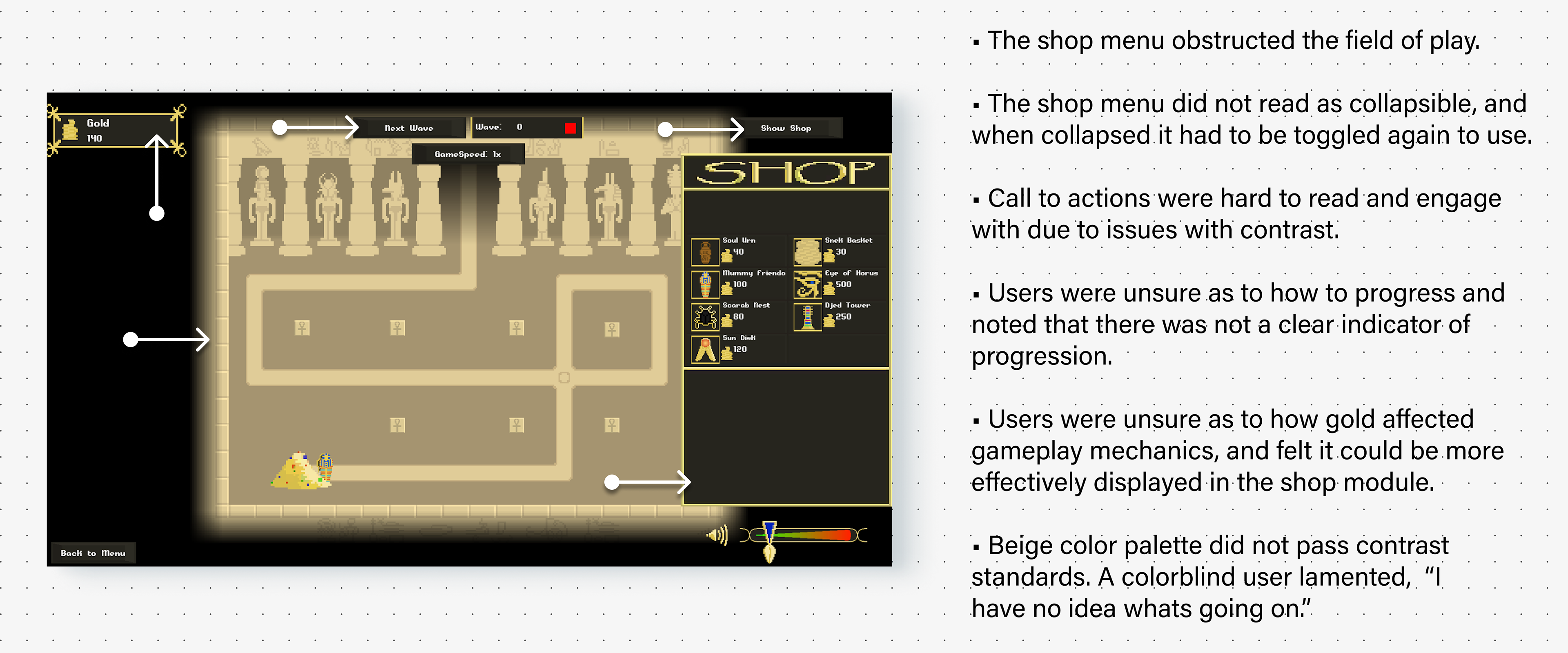
Insights
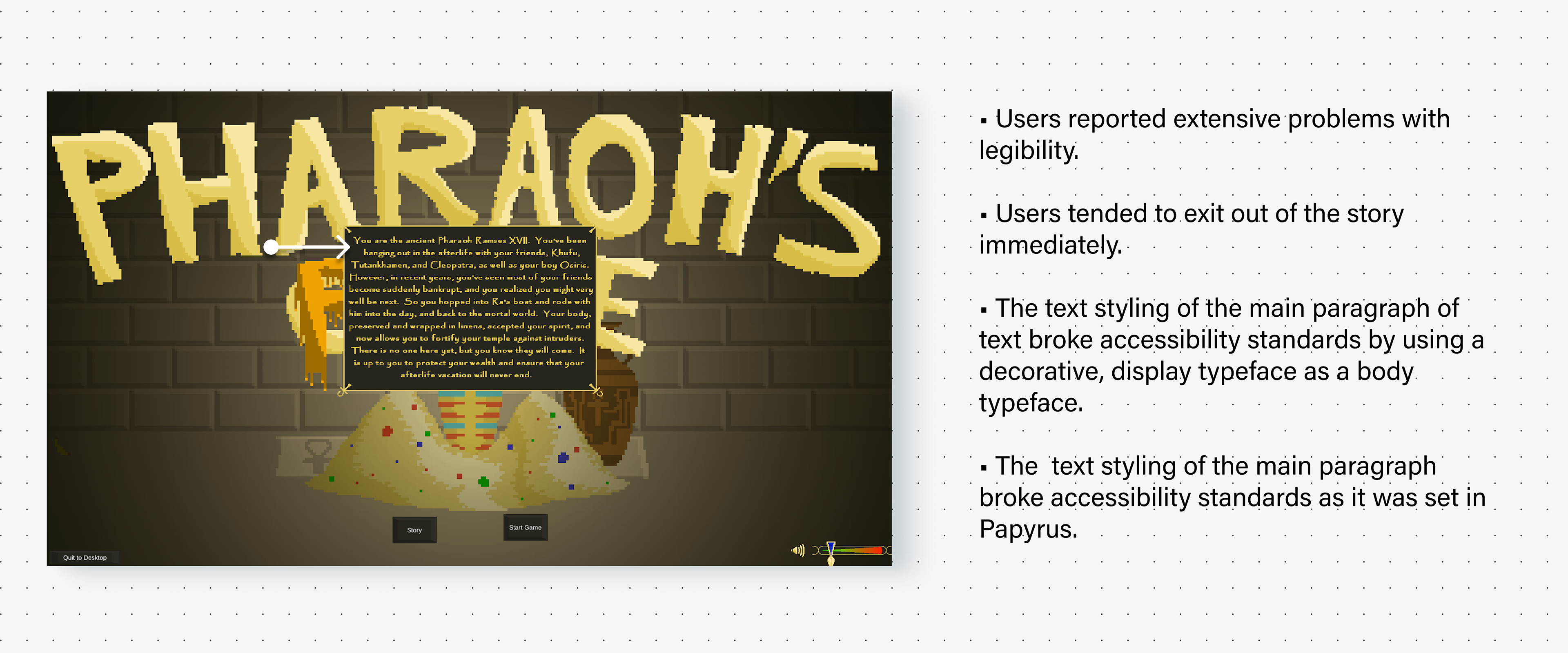
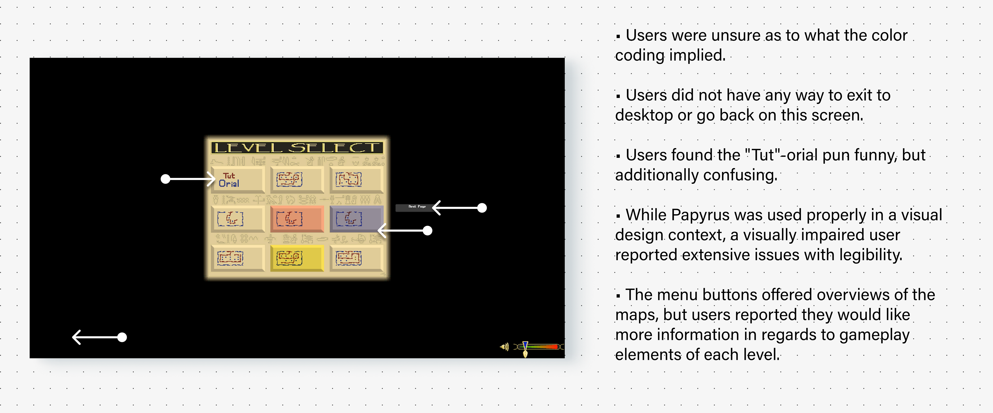
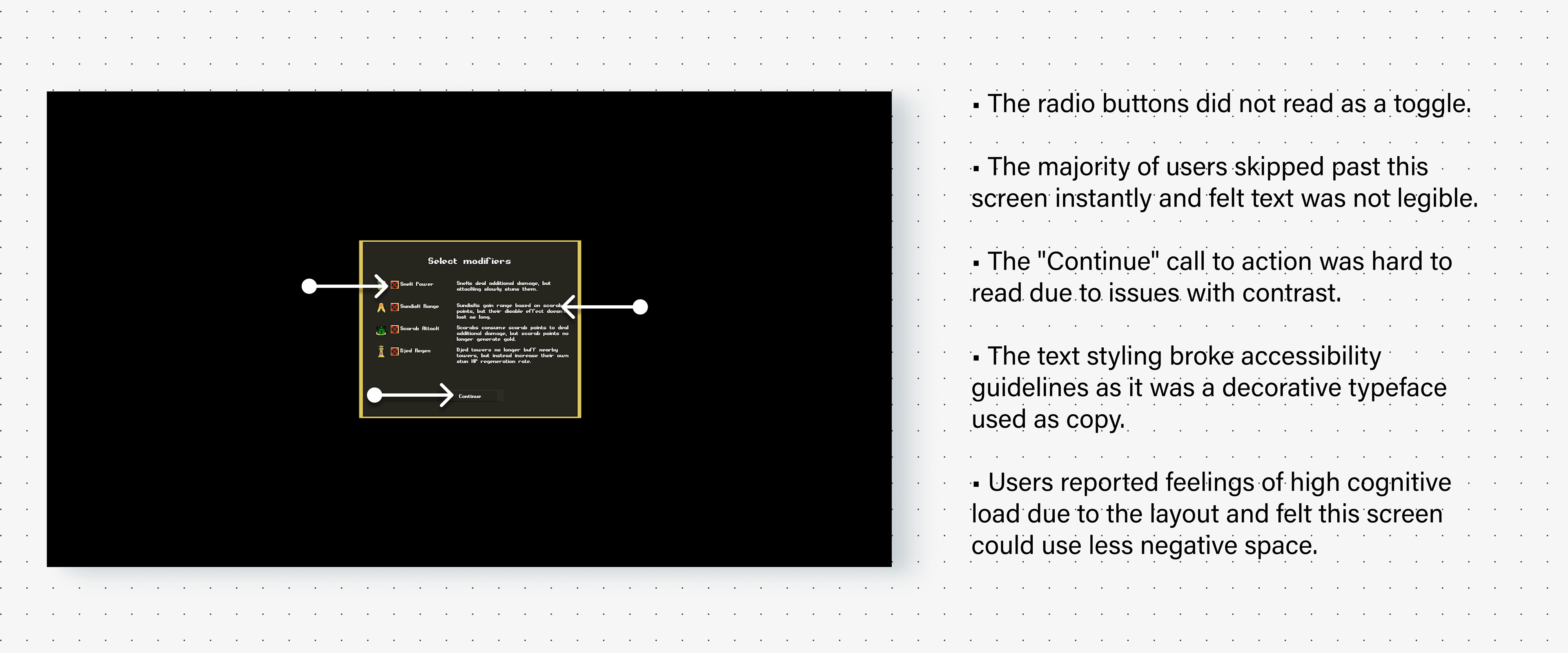
In user interviews we noticed first time users had extensive difficulties with text readability and felt that knowing how to play the game was not intuitive even with prior knowledge of tower defense games. The Tutorial was not clear and users skipped through it as well as most screens with high amounts of exposition due to issues stemming from accessibility as well as high cognitive load. Issues with readability and poor contrast meant users felt confused, frustrated, and were unable to develop strategies and become immersed with the meta, despite feeling affinity for the overall vibe and concept of Pharaoh's Purse.
TLDR
By making design decisions around the needs and frustrations of all users we can:
• Develop more effective UI.
• Qualm issues with playability.
• Shine a spotlight on the unique heart and spirit of Pharaoh's Purse .
• Develop more effective UI.
• Qualm issues with playability.
• Shine a spotlight on the unique heart and spirit of Pharaoh's Purse .
Process | Define
User Personas
Insights from aforementioned user interviews and survey screens allowed us to ideate personas and attune to the needs, actions, values and emotions of our target audience.
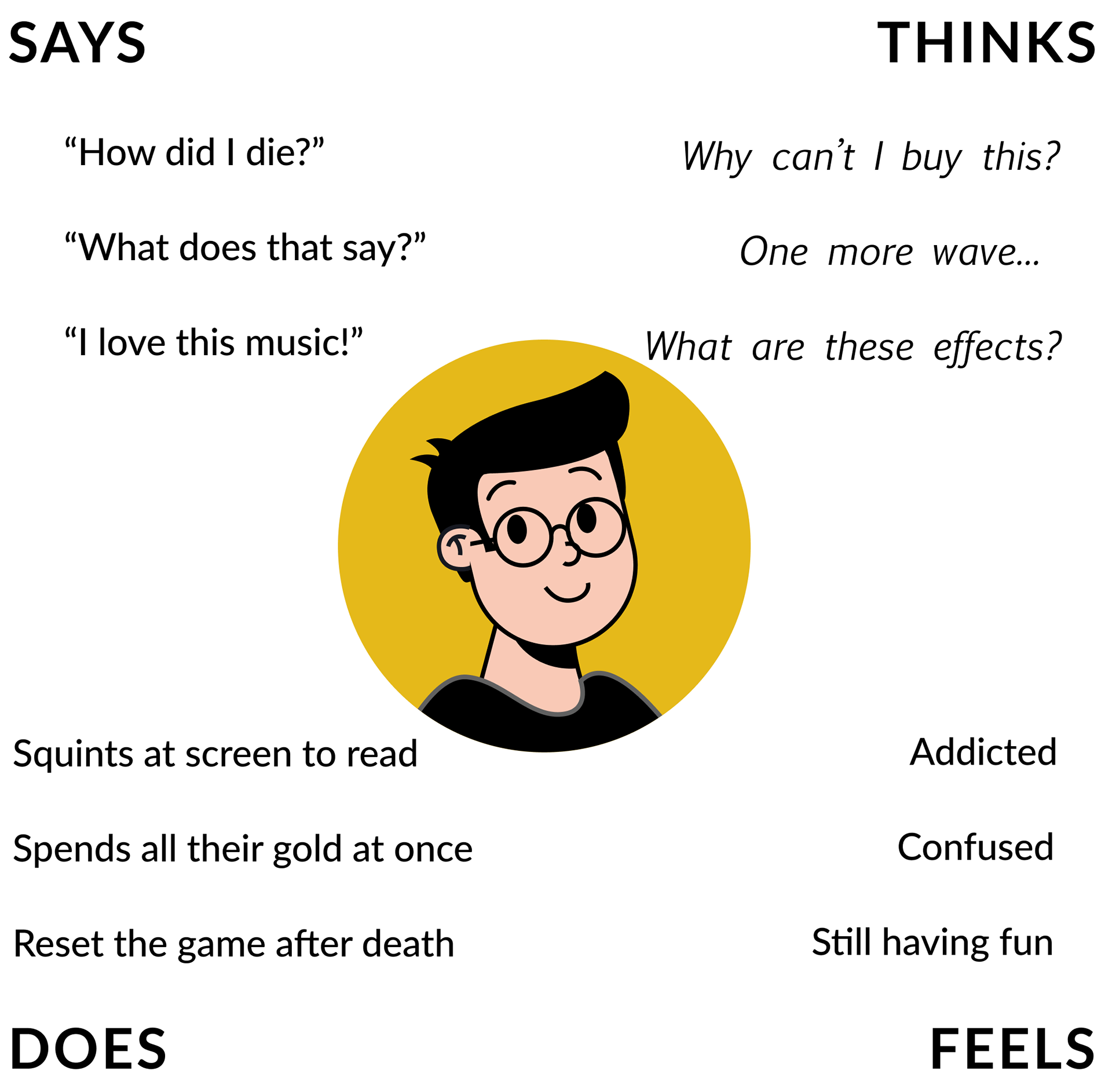
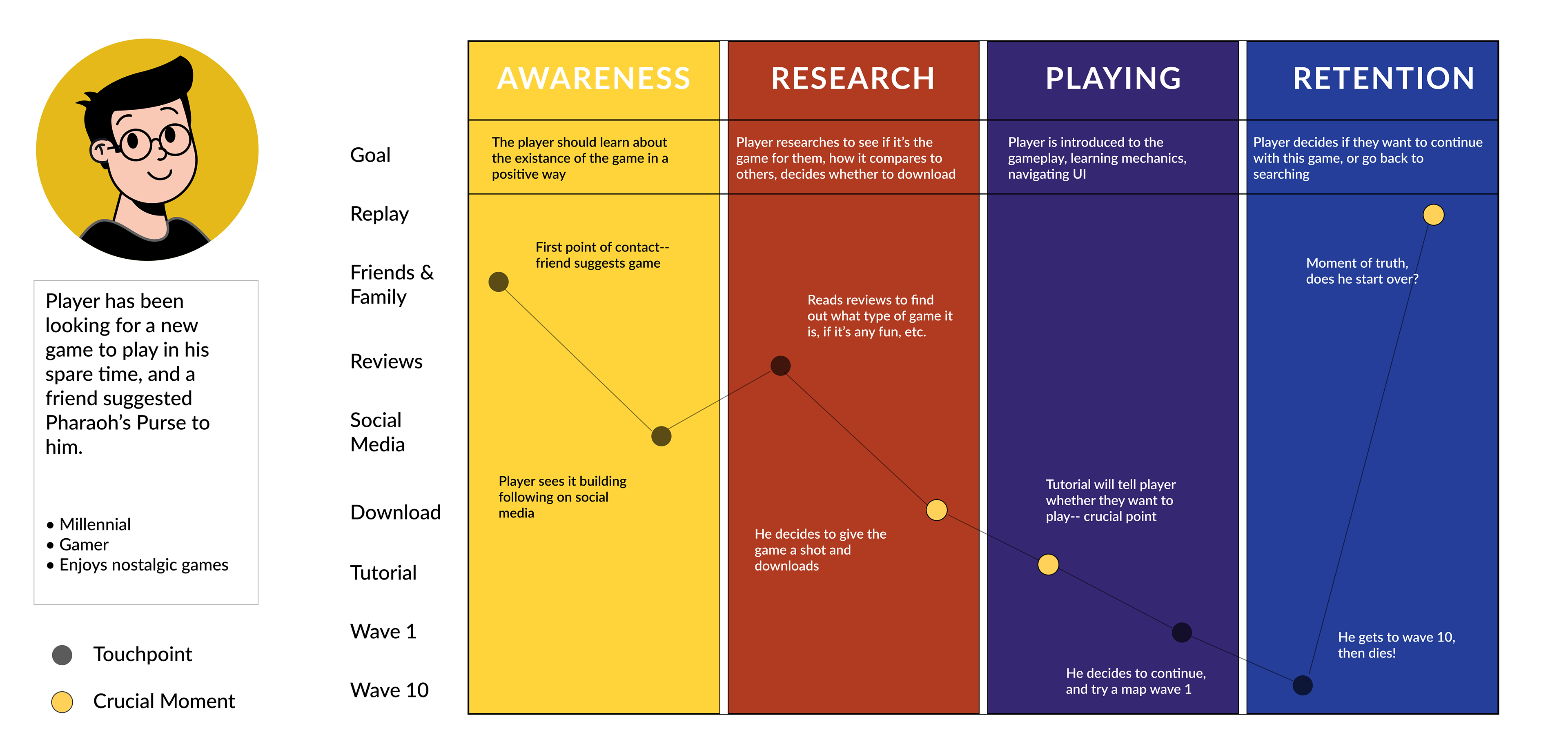
Empathy/Journey Maps
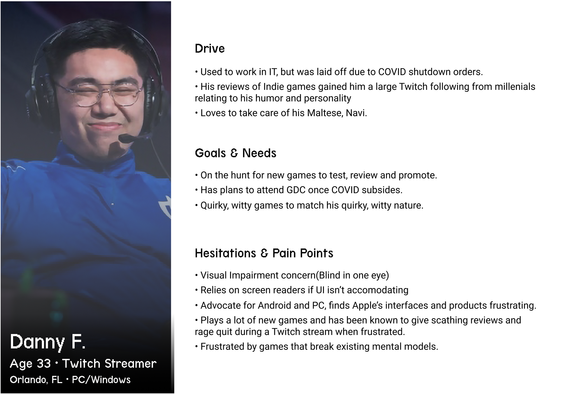
We interacted with Pharaoh's Purse from the perspective of the persona, Danny to attune to and identify potential features, pain points and areas of improvement.
Danny's Journey
• As Danny I would find Pharaoh's Purse on Itch.io.
• Effective Tutorial and gameplay mechanics capture my attention.
• I start to stream Pharaohs Purse on my twitch channel.
Key moments for Danny's user journey would be the context in which Danny finds the game; where he would hear about it and what would motivate him to download Pharaoh's Purse. Ideally, the tutorial would immerse Danny in the world and gameplay mechanics of Pharaoh's Purse. Lastly, we would have to ideate features to keep Danny wanting to play. How would we incentivize Danny to keep playing Pharaoh's Purse?
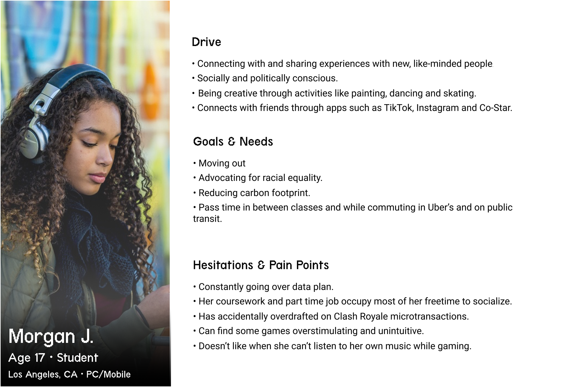
User Stories
• As Morgan I would: read the story to learn more about the world of Pharaoh's Purse and go go through the tutorial mode to begin crafting a strategy.
• As Danny I would tab through the tutorial and story impulsively play through eight waves on the first map and express my observations loudly on my twitch stream. I would probably revisit the tutorial after feeling immense confusion.
The archetypes of the casual and the more fanatical gamer informed the potential features and flows of the accessibility and usability focused iteration of Pharaoh's Purse. We chose to prioritize Morgan as she represents a younger audience that is less familiar with gaming, but open-minded to new experiences. We additionally chose to prioritize Danny as he is a gaming enthusiast, with a unique personality as well as a visual disability.
Process | DEVELOP
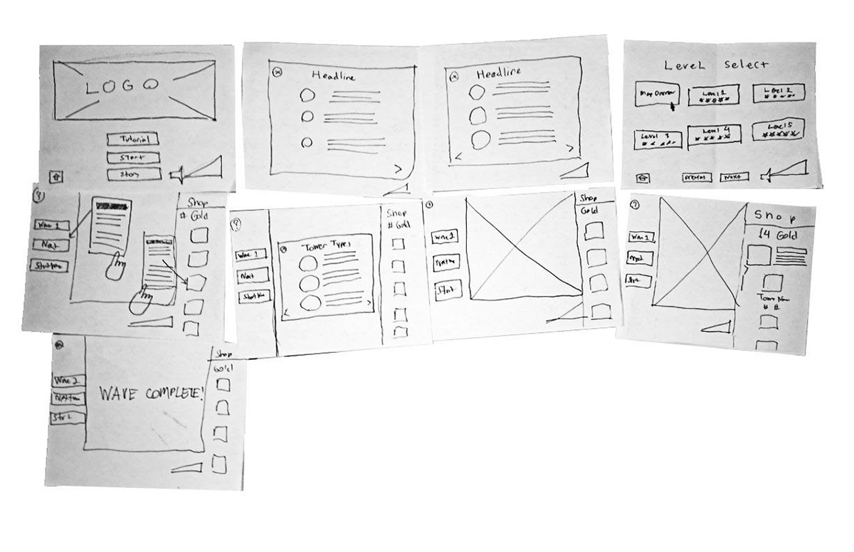
Sketches
Four up Sketches created after the user flow to include more helpful tutorial overlay's. Sketching helped me ideate information architecture as well as quantify the amount of screens and overlays needed for the eventual digital prototype.
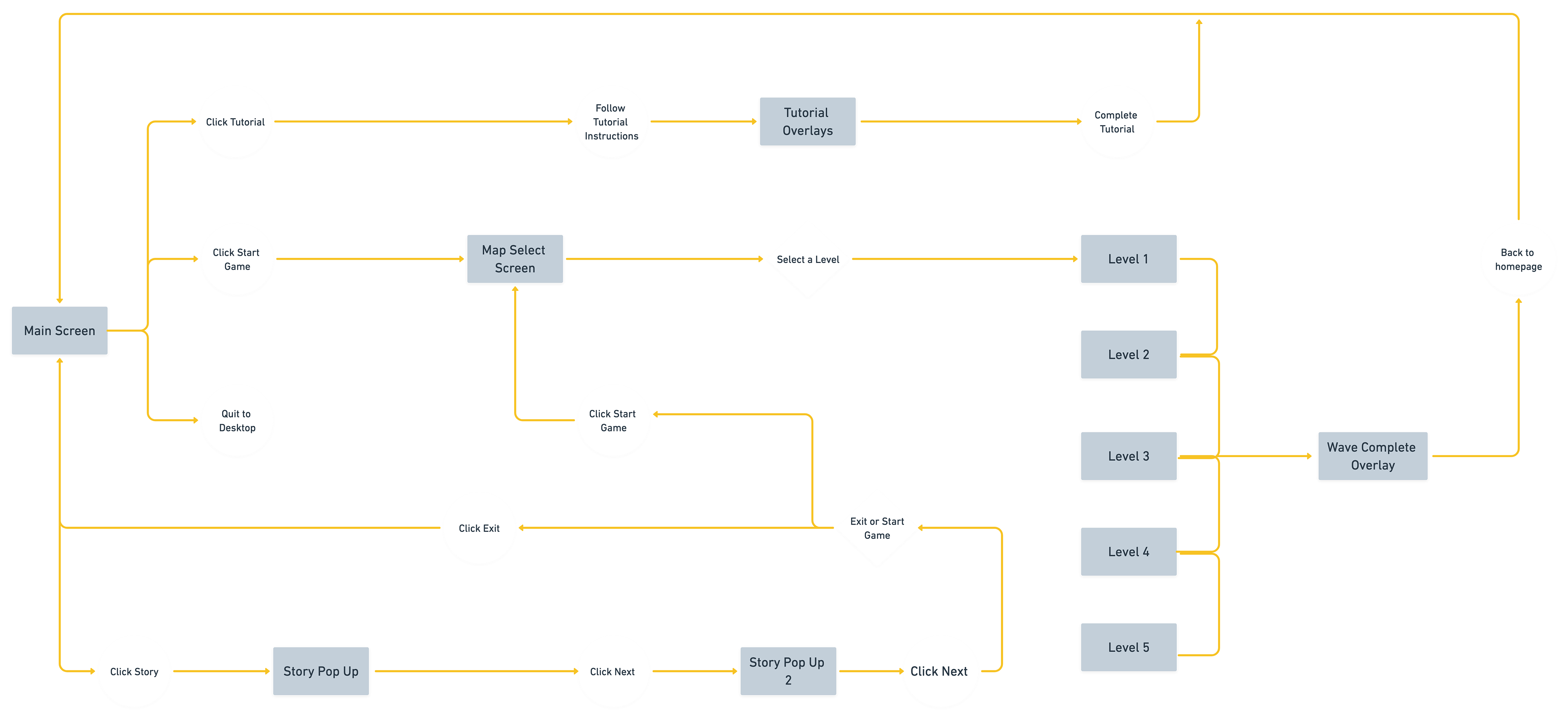
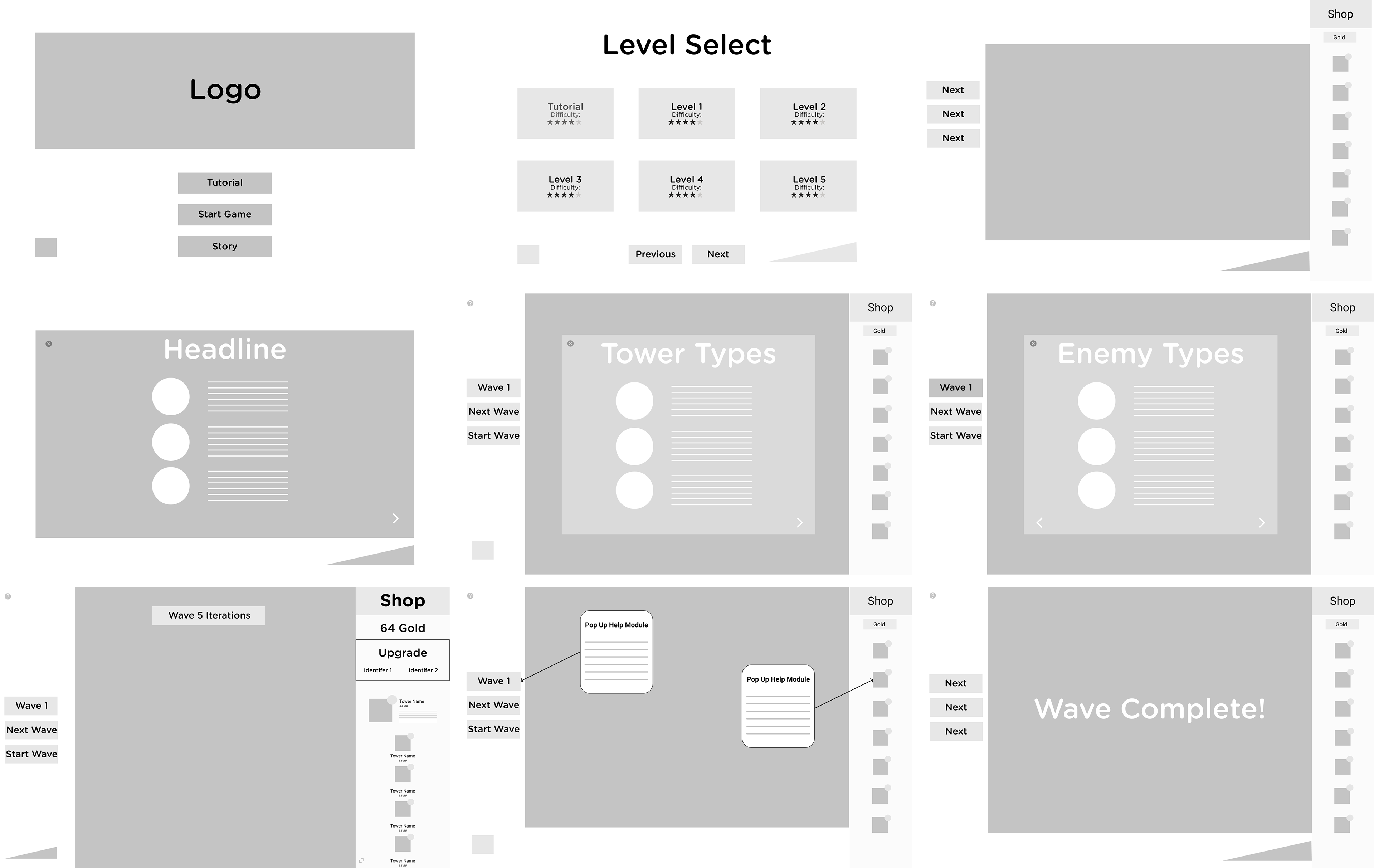
Wireframes
Digital Wireframes allowed me to expand and iterate from my initial sketches. I began to plan for features such as tutorial overlay's, upgrade menus as well as expanding the gameplay area itself.
Visual Design
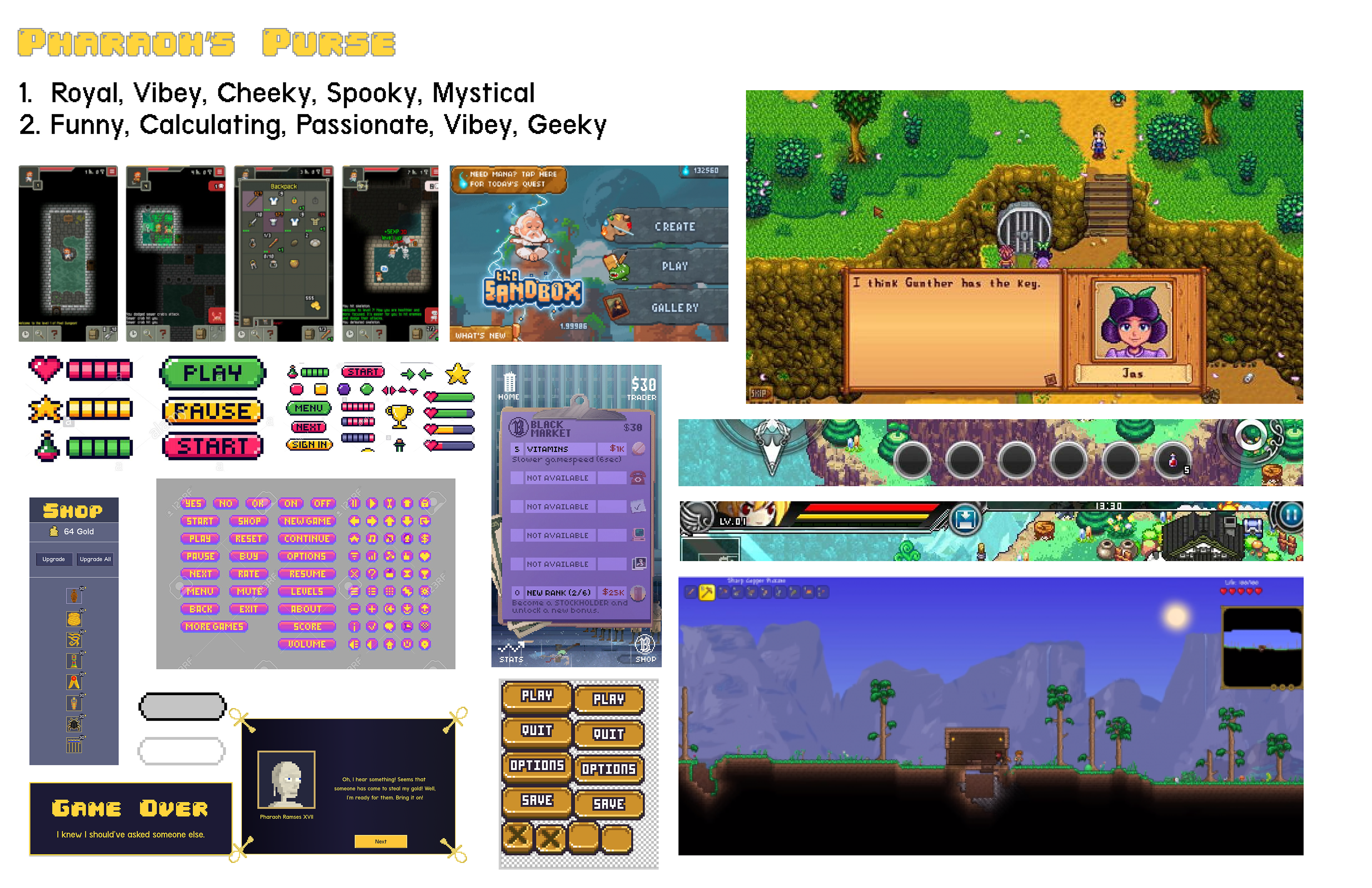
Visual Design was explicitly indicated to not be within scope for this project. From the perspective of our usability and accessibility audit we had to account for issues with color contrast, legibility and hierarchy. Before proceeding with any further prototyping we collaborated on a rough moodboard where we identified common patterns within mobile and pixel art games as well as potential color schemes.
Additionally we cross referenced similar products to reference existing mental models, flows and patterns. We looked for large instances of exposition being presented in a pixel art style in games such as Stardew Valley and Terraria to see how the problems we were encountering with the initial builds issue with legibility were resolved. Additionally, we played rounds of Clash Royale to see how an intuitive tutorial was made.
Additionally we cross referenced similar products to reference existing mental models, flows and patterns. We looked for large instances of exposition being presented in a pixel art style in games such as Stardew Valley and Terraria to see how the problems we were encountering with the initial builds issue with legibility were resolved. Additionally, we played rounds of Clash Royale to see how an intuitive tutorial was made.
Process | Deliver
Prototype V1
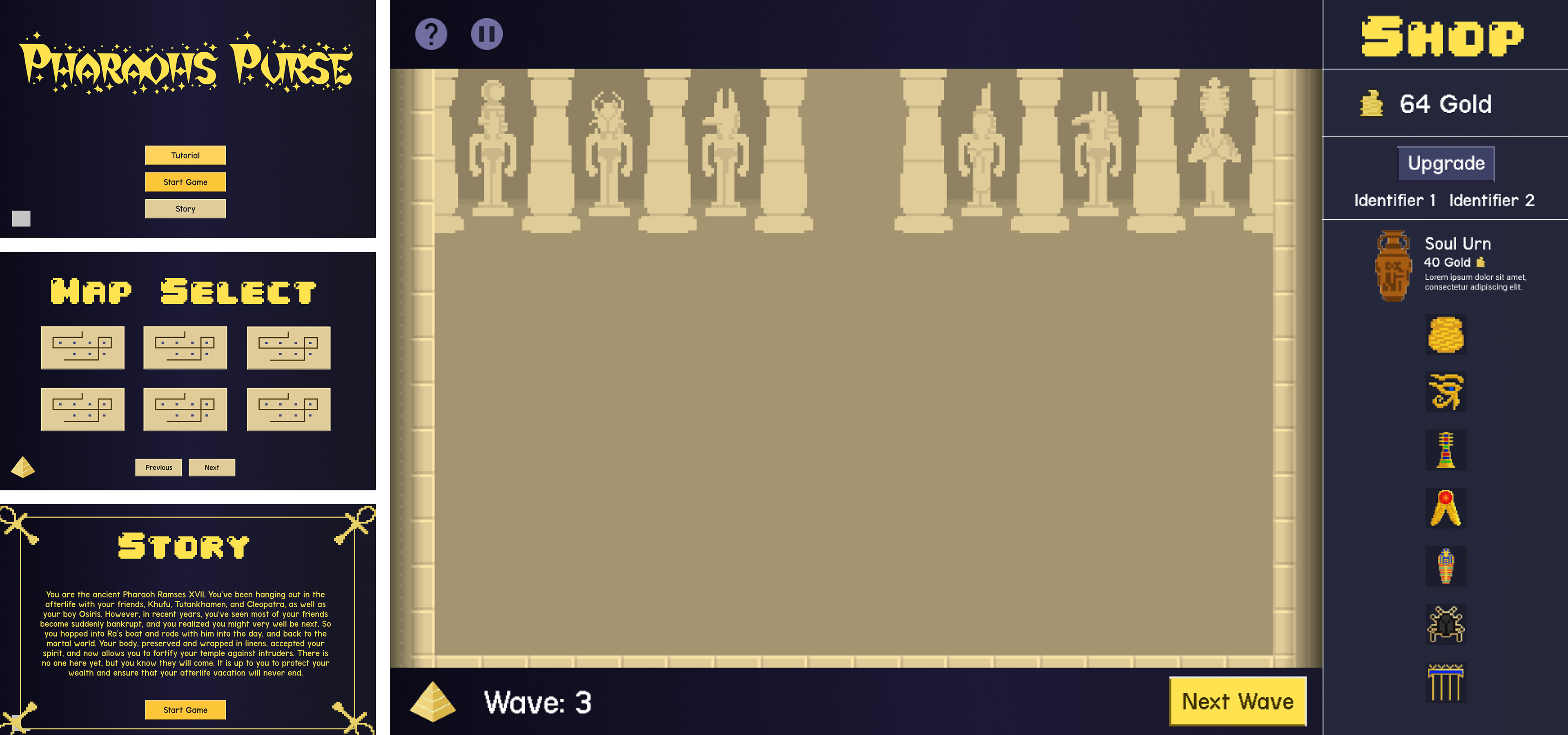
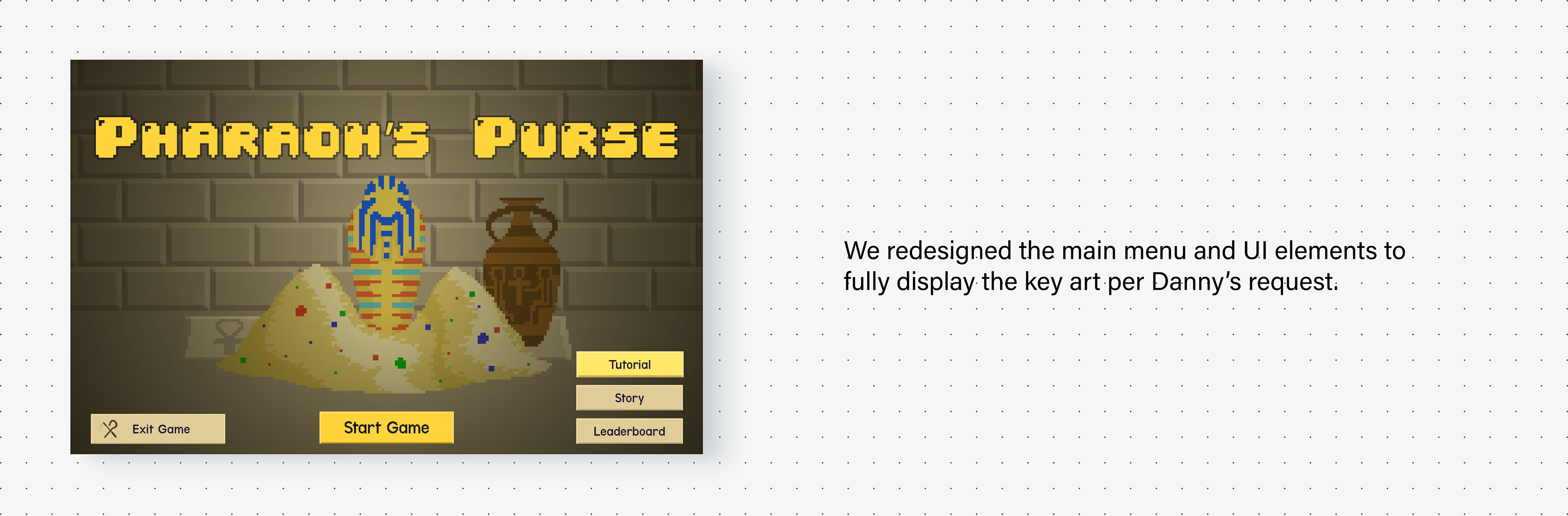
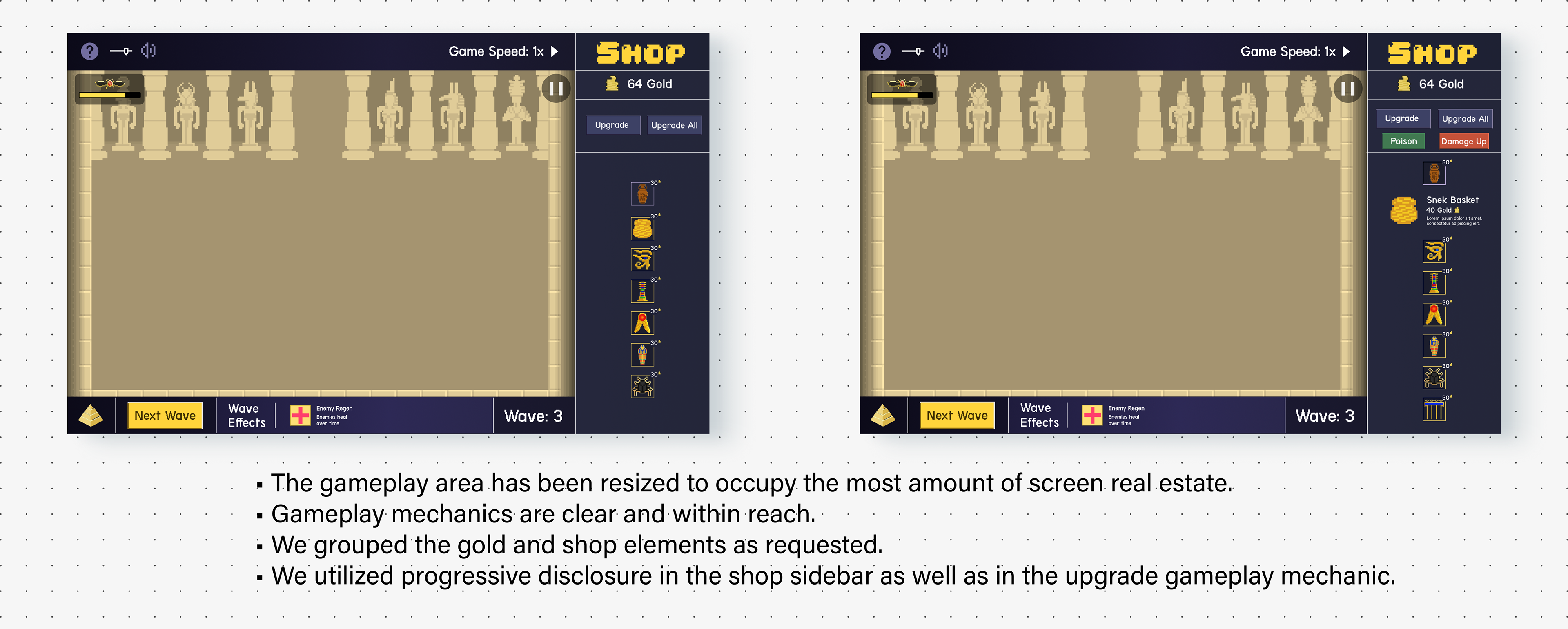
MemeRegime requested whatever design decisions we made to reflect either the Ancient Egyptian as well as pixel art themes. The new color palette was a decision striving to pass accessibility standards as well as reference the look and feel of night time in Ancient Egypt. Additionally, we expanded the gameplay area to take up the most screen real estate and displayed a collapsible sidebar to reduce cognitive load.
Prototype V2
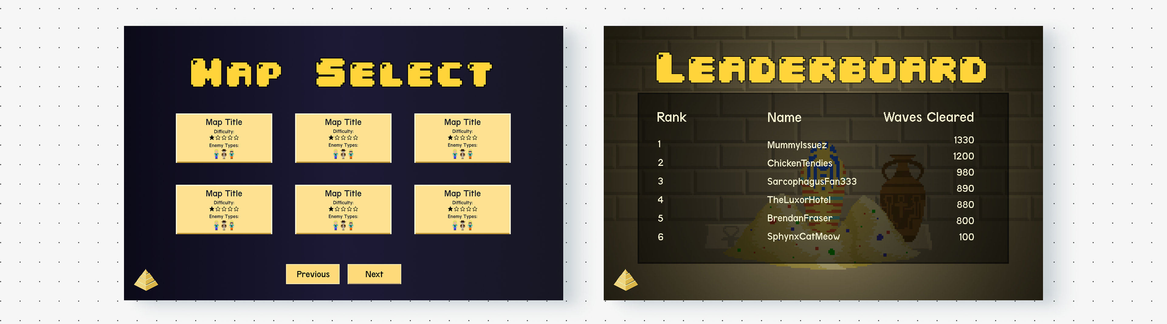
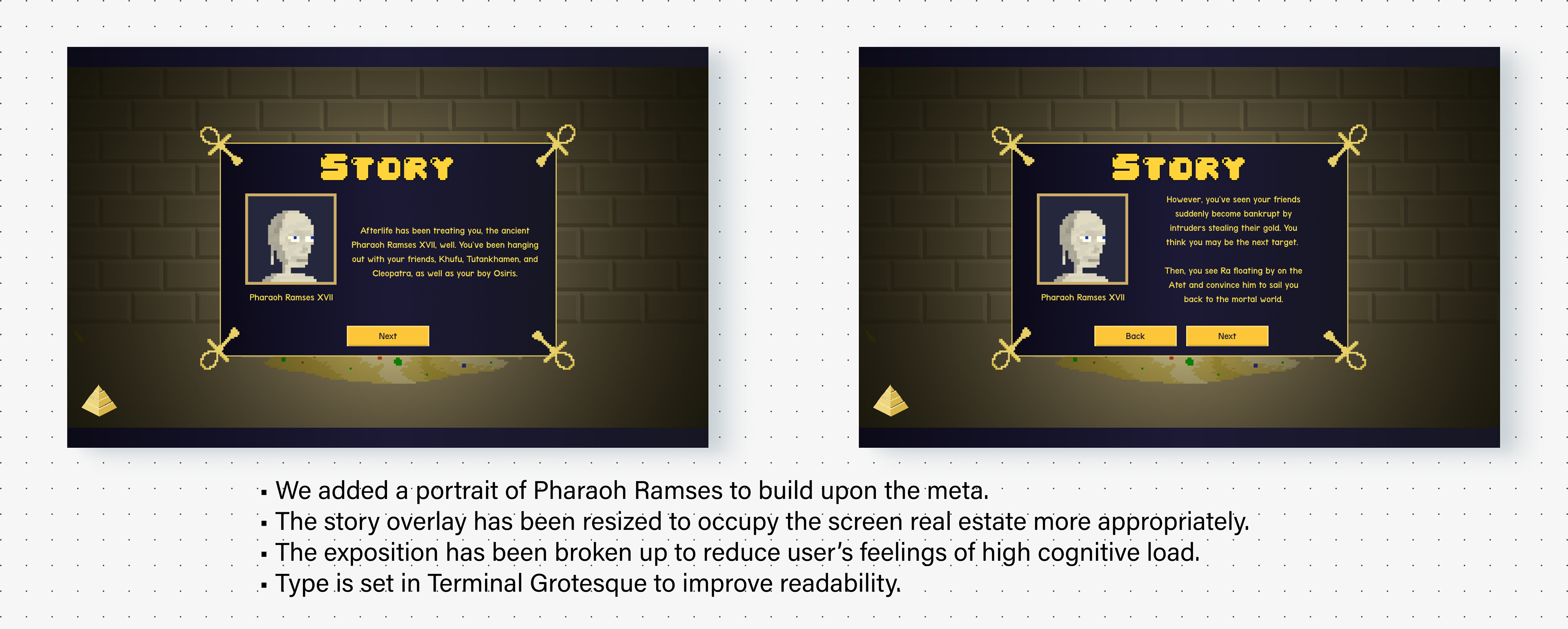
We added a leaderboard to hopefully attract user retention and begin to attempt enticing Danny to play through the game again. We utilized progressive disclosure in a hover state for the map select to increase usability and introduce gameplay mechanics to newcomers like Morgan. Additionally, the pursuit of usability dictated the need for a pause menu, more sequence overlays for the back story, as well as an overlay which outlines the modifier game mechanic.
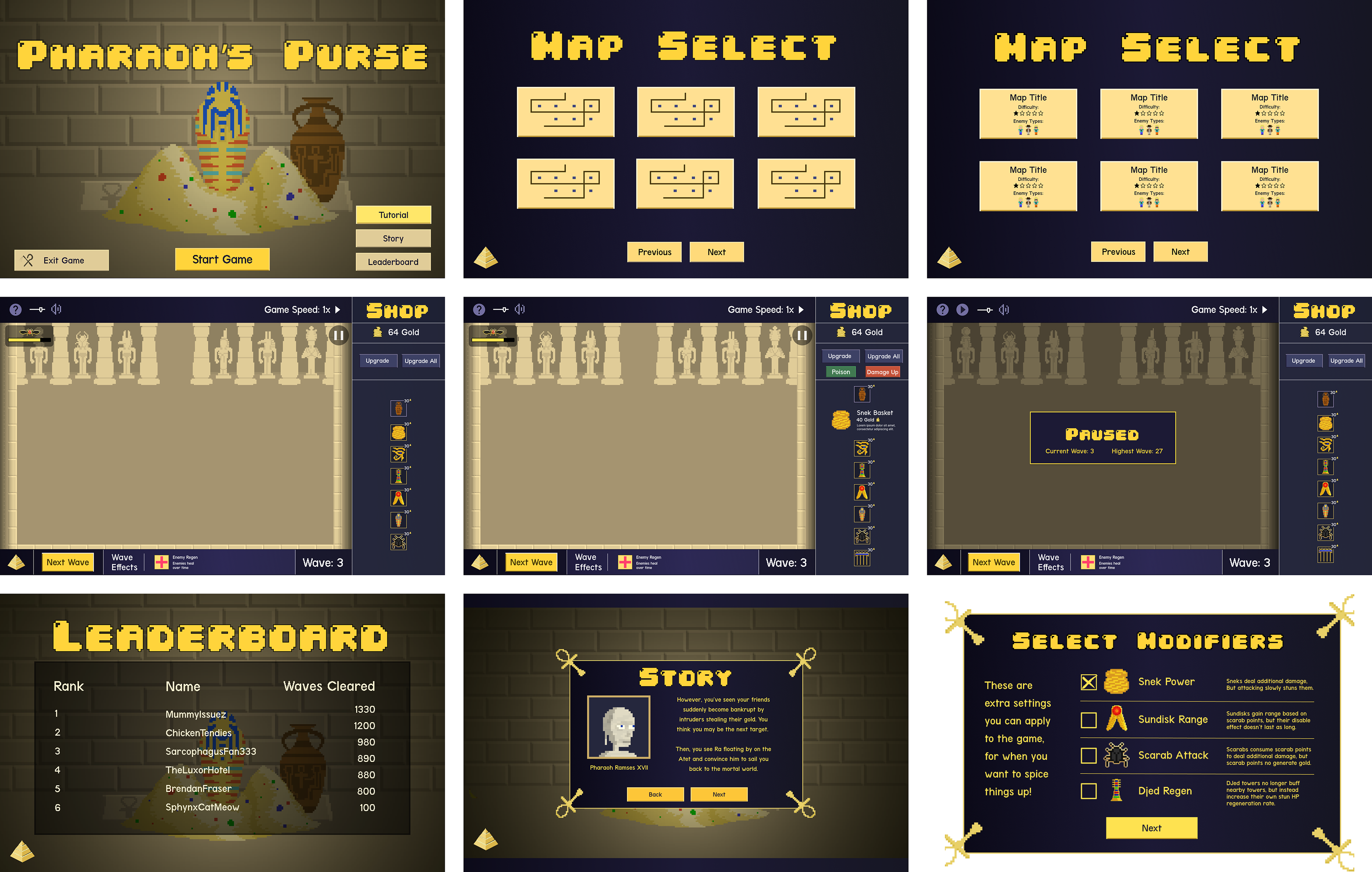
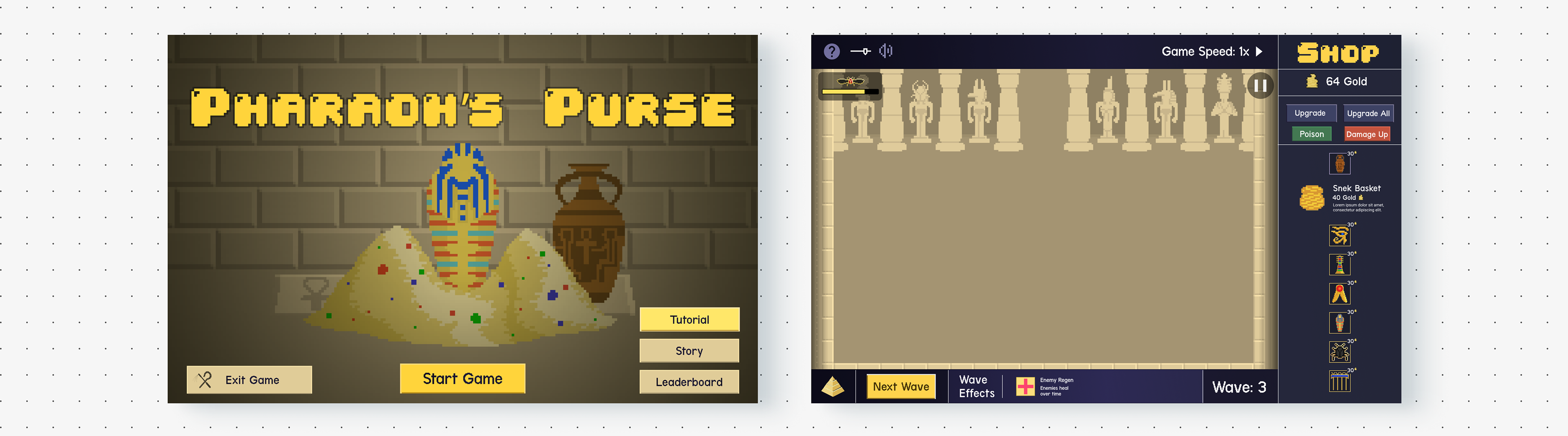
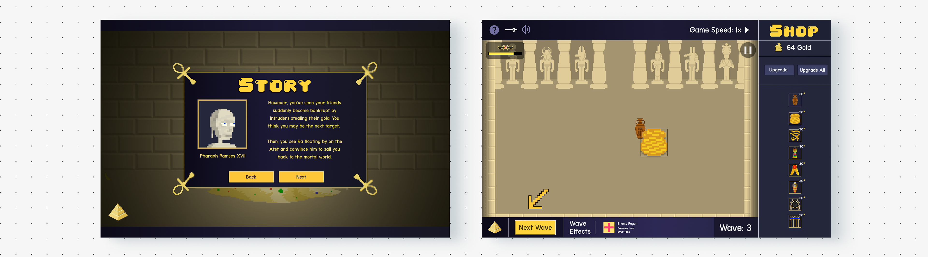
FINAL ITERATION | LIVE PROTOTYPE
Main Screens
Story Screens
Gameplay + Leaderboard Screens
Overlay Screens
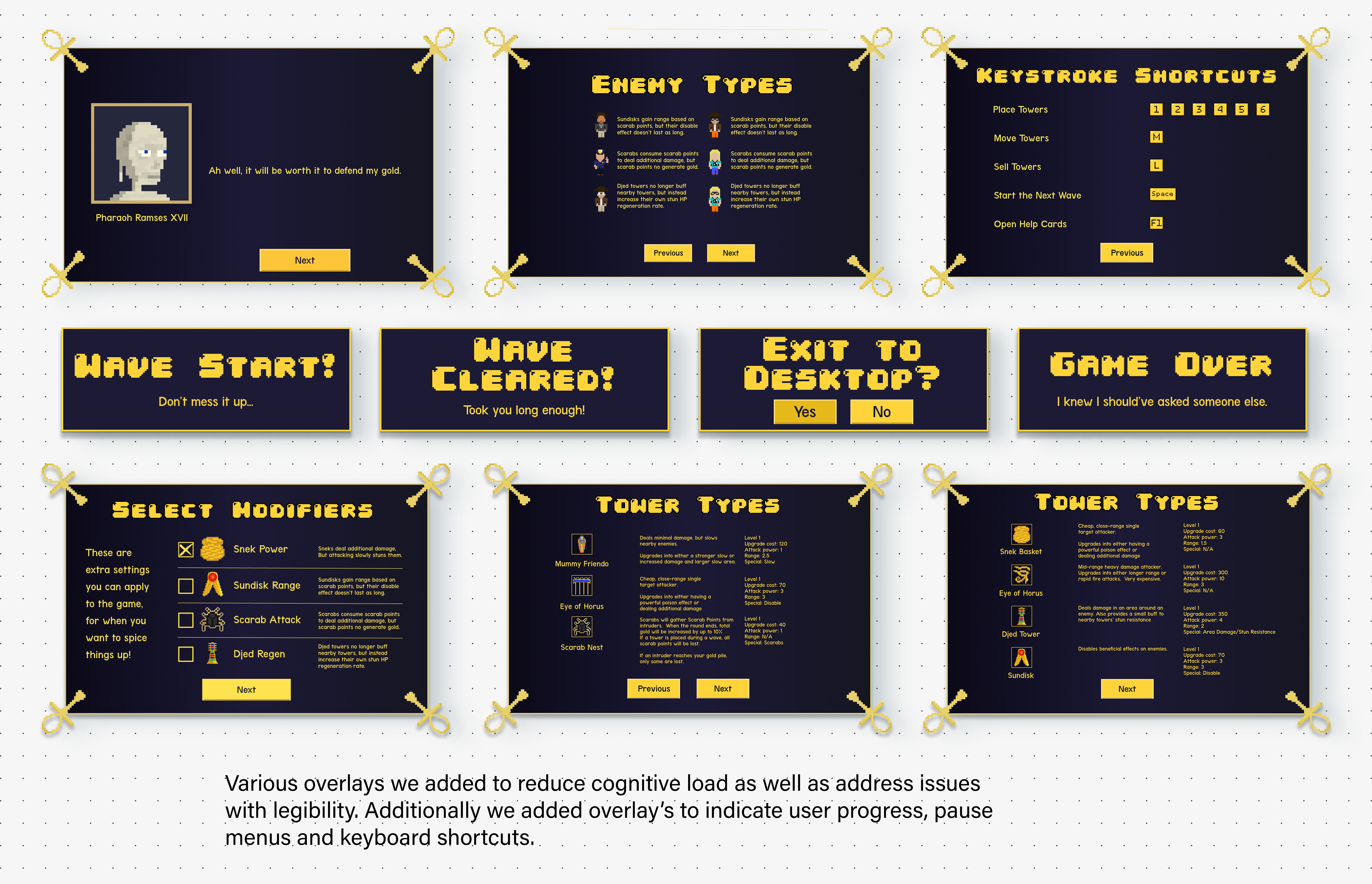
Tutorial Screens
USability Testing | Round 2
Scenarios Tested
As soon as the latest prototype was ready to ship we retested the three main tasks per the project requirements:
• Read the story
• Go through the tutorial mode
• Play through eight waves on the first map
• Read the story
• Go through the tutorial mode
• Play through eight waves on the first map
“I forgot it was a Figma Prototype.”
Insights
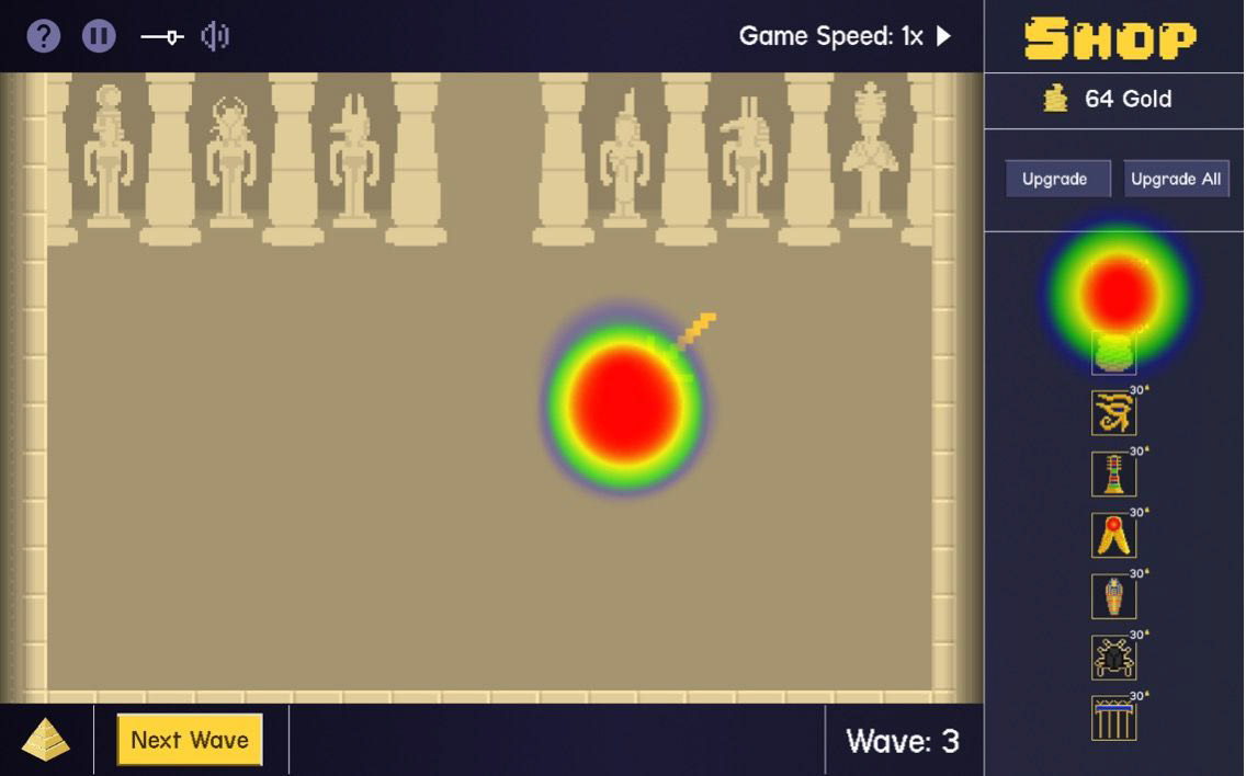
We found remarkably more enthusiastic feedback from this round of testing. A user who's personality and insights shaped a lot of Danny's characteristics enthused, " I forgot [this] was a Figma Prototype". User's noted they would love a mobile port-out and noted the biggest improvements were to aspects of visibility, readability and the tutorial itself. These improvements allowed users to become immersed in the world of Pharaoh's Purse by improvements from our usability and accessibility audit allowing them to more clearly interact with it's unique exposition, content and gameplay mechanics. Additionally, we tested Heat Maps to find quantitative data to see how our Accessibility and Usability audit affected user interaction.
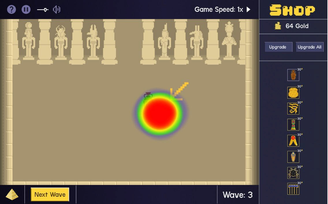
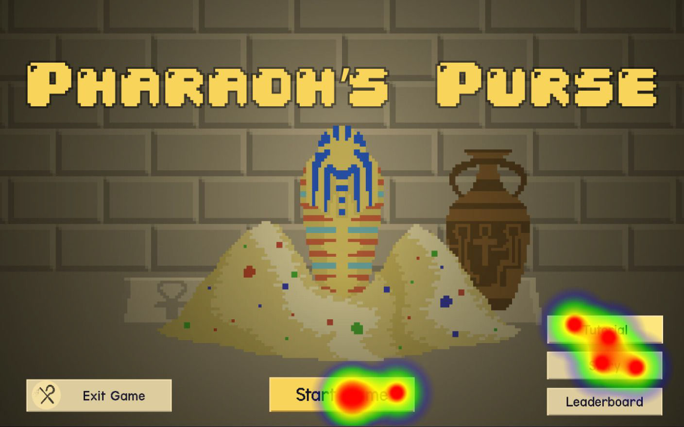
Quantitative Data | Heat Maps
After our final round of user testing we ran our prototype we used the Maze analytics program to gather quantifiable data . The participants for this section were first time users tasked with following certain "mazes." Users successfully completed the tutorial but tended to skip through story-building and exposition heavy overlays indicating a mechanic that could be improved in later iterations.
Conclusion
Whats Next?
MemeRegime is currently working on a story mode to give the users something to come
back to over and over again and expand upon the meta. The last round of user testing additionally helped us identify more pain points and potential areas of improvement. Users felt like the game could be improved even more by making area of effect indicators more clear, animated UI, sound design, health bars for all characters on screen, microtransactions and most notably a mobile port!
back to over and over again and expand upon the meta. The last round of user testing additionally helped us identify more pain points and potential areas of improvement. Users felt like the game could be improved even more by making area of effect indicators more clear, animated UI, sound design, health bars for all characters on screen, microtransactions and most notably a mobile port!
What I learned
• Team Building
• Communicating design concepts with developers.
• Iterating from User and Client feedback.
• Prioritizing business requirements.
• Determining what is within scope.
• Agile Methodology
• Time Management
• Communicating design concepts with developers.
• Iterating from User and Client feedback.
• Prioritizing business requirements.
• Determining what is within scope.
• Agile Methodology
• Time Management